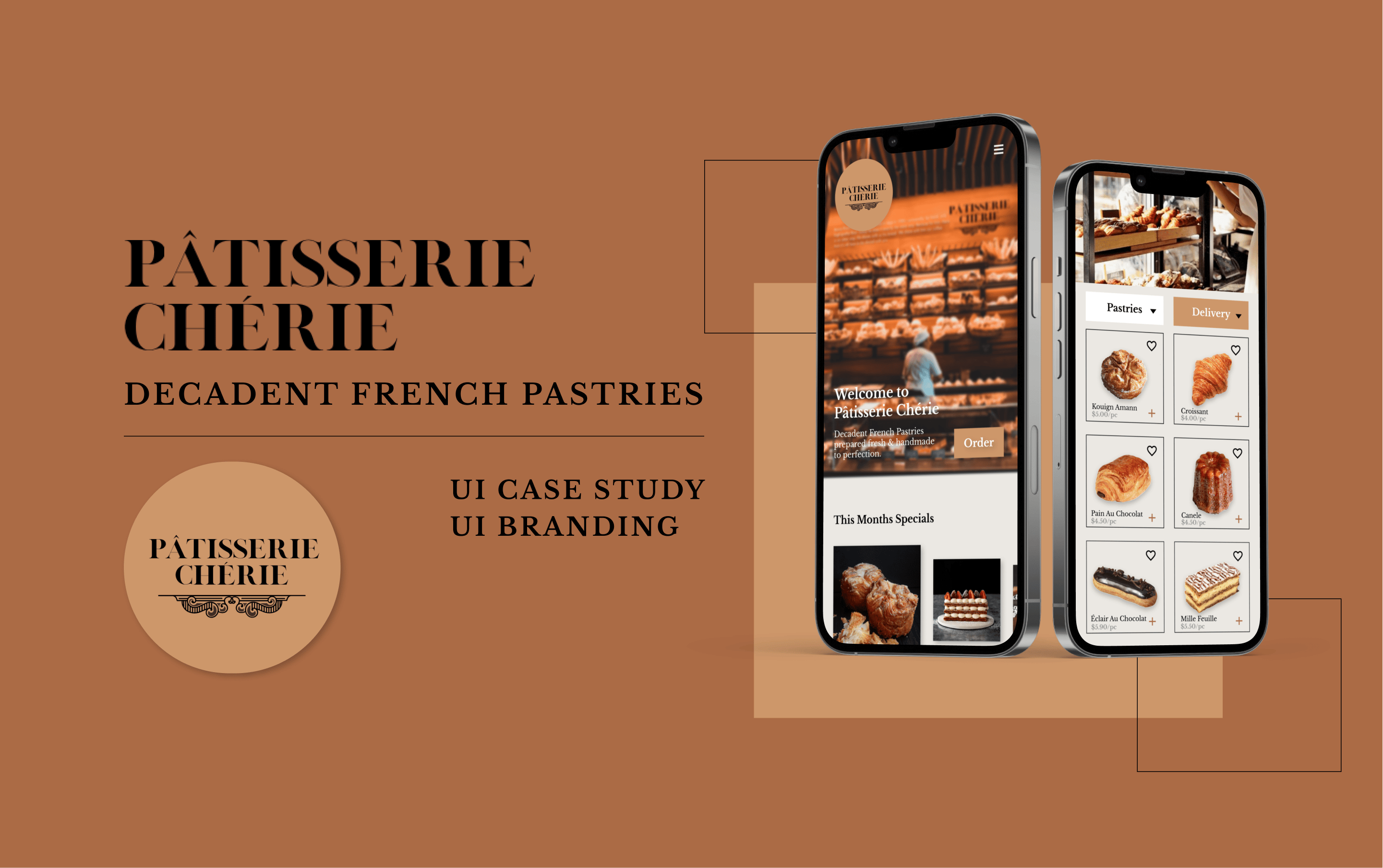
Overview
This project is a UI case study with an objective that will help everyone find products quickly and easily to match their particular needs. This eCommerce platform will offer guests timely orders, delivered to their homes & businesses, or picked up at the bakery, without compromising the quality of the pastries. This platform has features like important information on how to indulge, share, and store for ultimate freshness. Additional features are a list of ingredients of each pastry for transparency.
About Pâtisserie Chérie
Pâtisserie Chérie is a french family-owned bakery that delivers excellent artisanal pastries. The brand guidelines represent craftsmanship, community, and integrity. The baked goods are decadent & hand-crafted daily to perfection.
Problem
Cusumers don’t have the time or ability to visit physical stores and would rather buy their goods on the go or from home. They enjoy the advantages of 24/7 shopping from their homes. It’s also more convenient, generating a faster buying process. Additionally, there are other perks of having a brick-and-mortar store expanded into an eCommerce. The potential customer base is much larger and can potentially be located anywhere there is internet.
Solution and Features
Offering a eCommerce platform for a french pastry shop that will offer guests timely orders, delivered to their homes & businesses, or picked up at the bakery, without compromising the quality of the pastries will allow convenience and efficiency for those that don't want to go to the physical store. This will also allow the business the reach more customers from all over the world.
Drafting the Brand Guidelines
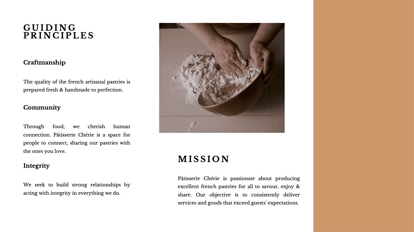
Guiding Principles
These are the further documented steps that I took drafting the brand guidelines document.
While crafting the guiding principles, I invisioned Pâtisserie Chérie to be a luxury French owned bakery that offers excellent pastries. Their company core values speaks volumes into their overall mission. I wanted to include integrity as a core value because with food comes transparency in the ingredients and how its made. With that, we could build positive relationships with the community.
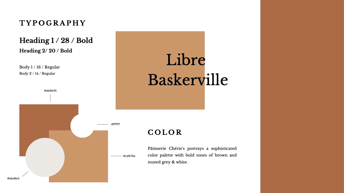
Logo, Typography and Color
While exploring font families, I wanted a font that portayed the brand principles and values. I knew I wanted to go with LONDON, serif typeface for the logo because it evokes tradition, sophistication and a formal tone. As for the body text, I chose a san serif font, Libre Baskerville because it's the type of font that is intellectual, modern and easy-to-read. It worked out successfully as both of the fonts establish luxuriousness, decadence and values craftmanship, integrity and community.
When designing for Pâtisserie Chérie, I kept their values in mind and came up with the neutral toned color palette. I wanted to bring out that rustic and warm setting when going into physical store, seeing all the light tone colors of the pastries.

Writing Style
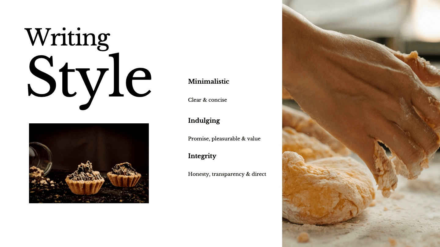
Accessing the way a brand speaks to its users is just as important as how it looks. In terms of brand guidelines, a writing style will be defined to align the voice and tone of the brand with the overall brand principles. Writing Style helps me identify and define the level of formality, whether it be friendliness, seriousness or fun. I want Pâtisserie Chérie to be minimalistic, indulging and speak with integrity. More specifically, the tonality throughout the app have copy that will offer transparently such as ingredients, additional information on order, while promising the value of freshness with the pastries.
Imagery
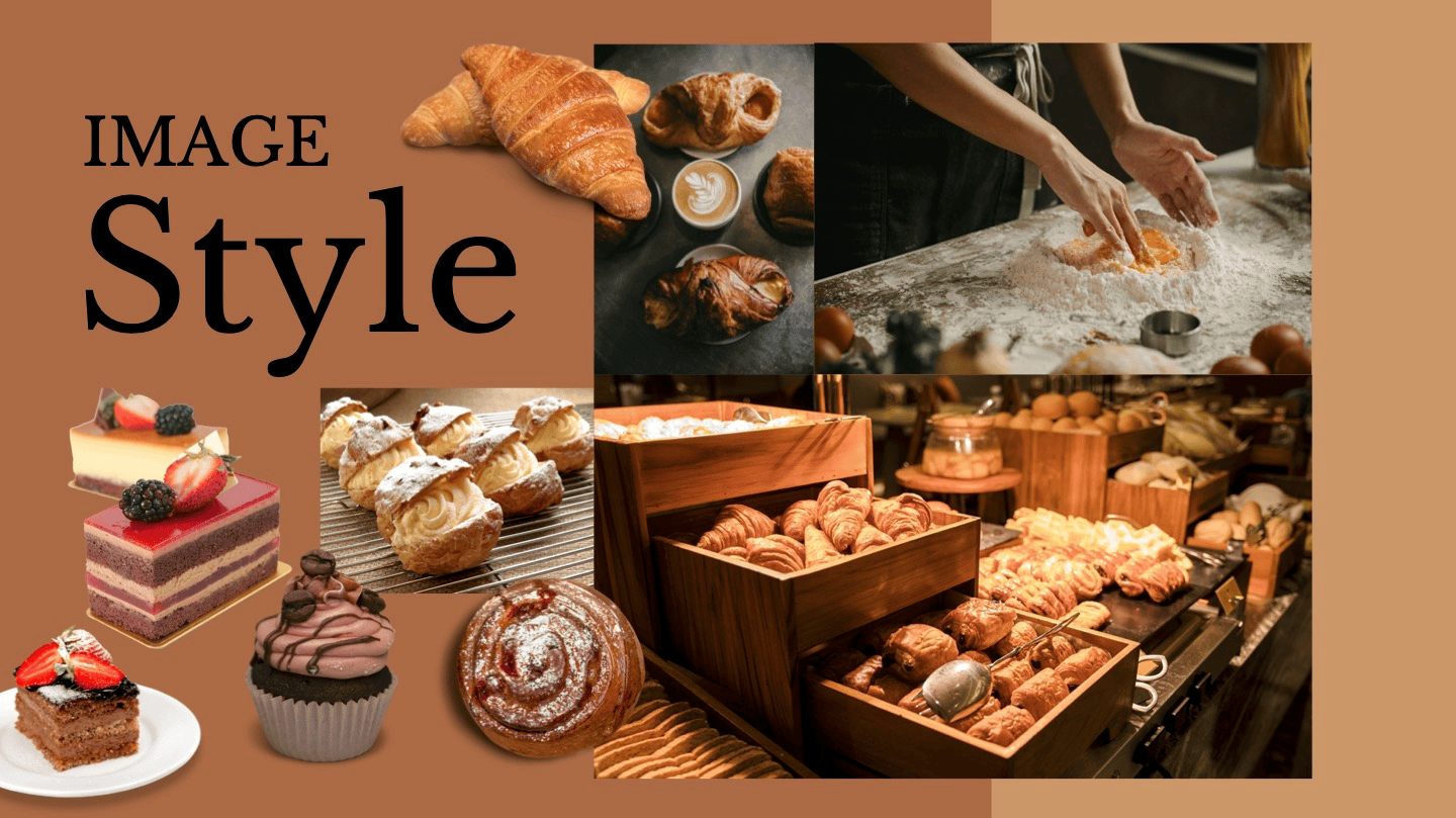
The imagery evokes Pâtisserie Chérie's craftmanship and dacadence. I specifically picked out the product images along with the image features on the homepage to be cohesive throughout.
User Stories
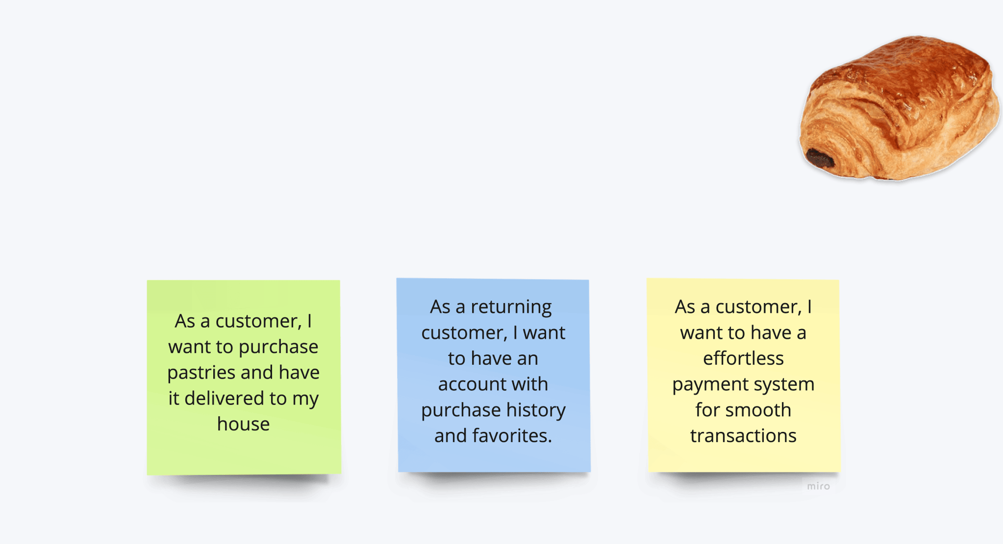
Next, I brainstormed every functional need (task) the user may have and paired them with an outcome. I drafted the main 3 success criterias with their corresponding features that the user will take to complete their goal. I found that these criterias are the basic but crucial functionalities of an eCommerce. Each of these user stories comes with experiences that will next be drafted in the user flow.
One of the goals were to be able to purchase pastries and have them delivered. I knew having pastries delivered is a bit challenging while it's perishable. Having it come fresh was the challenge but it's possible if it insulated and frozen. This is where having that addtional feature that goes over how to properly store the pastry is important. Building a story is important because it allows you to imagine how the task and goal is imagined along with the contraints.
User Flow
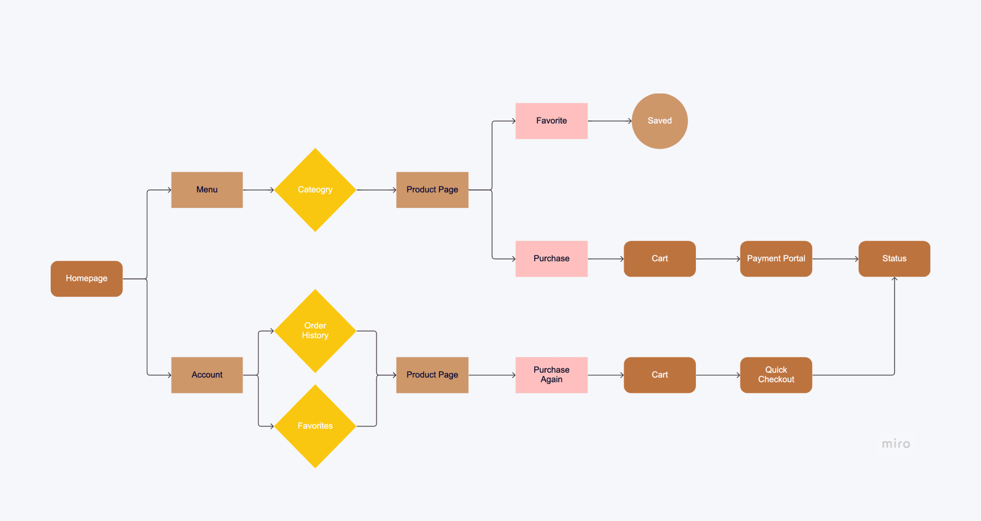
There 2 main navigation in this combined user flow. This process involved thinking through every screen, choice, and action the user must take to do specific tasks within the app. As the purchasing, favorites and payment system is the 3 crucial user tasks, these make it the important screens to connect given how ever many navigational routes there are. The navigation will have the 3 tasks/success criteria met that leads to the last screen: the order status. These all start at the same homepage and can go through the favorites to repurchase or do it from the beginning.
Wireframes
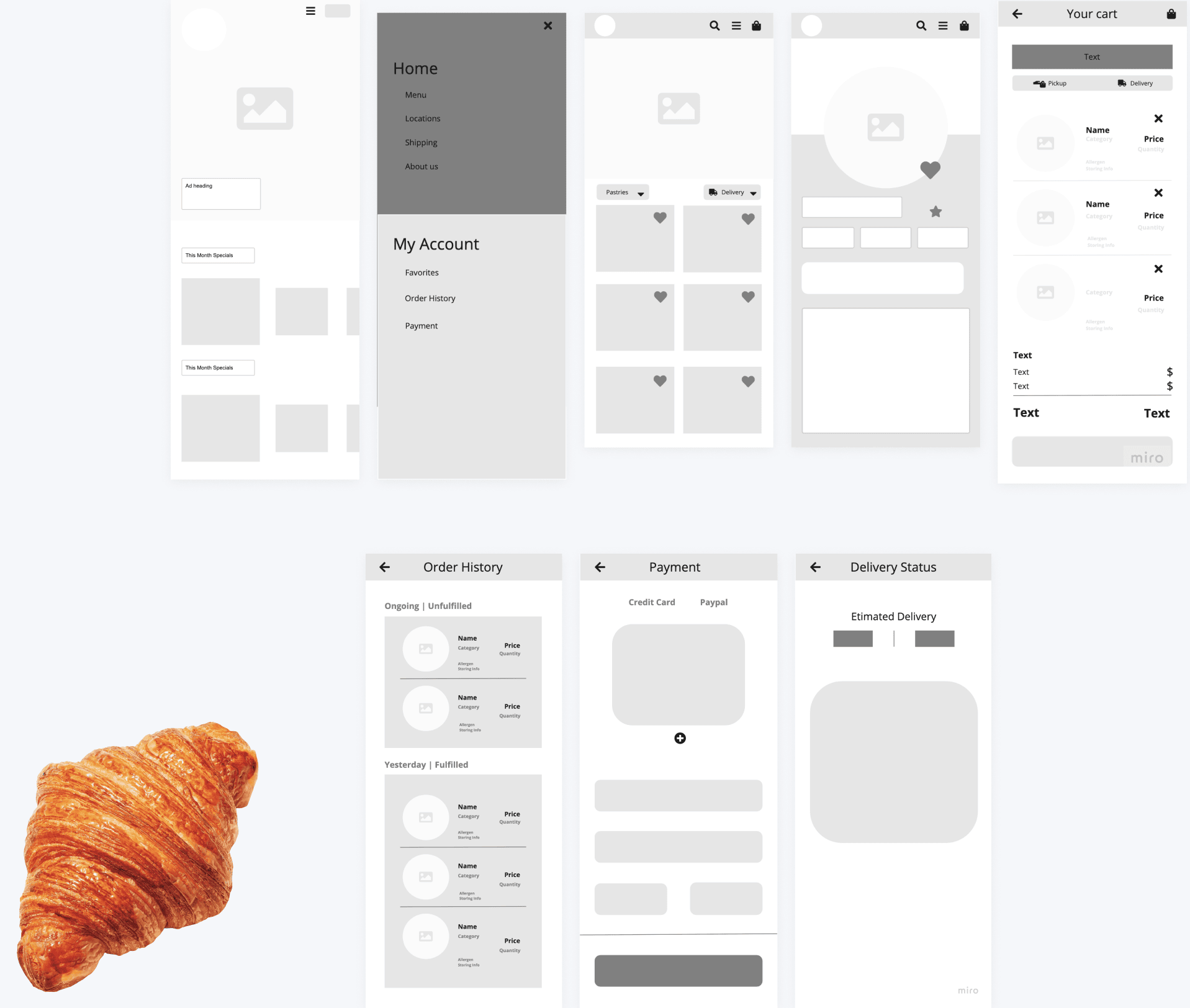
Low-Fidelity
After I mapped out the user flow. I had a general idea of how the screens would look like. I start low-fi sketching using Miro. This made me strategically place the navigational inputs and design elements so that it made sense. Drawing out and picturing the visual hierarchy and information architecture is critical during this phase because there are numerous elements that are not taken into consideration when mapping out the combined user flow. This is typically the longest process for me.
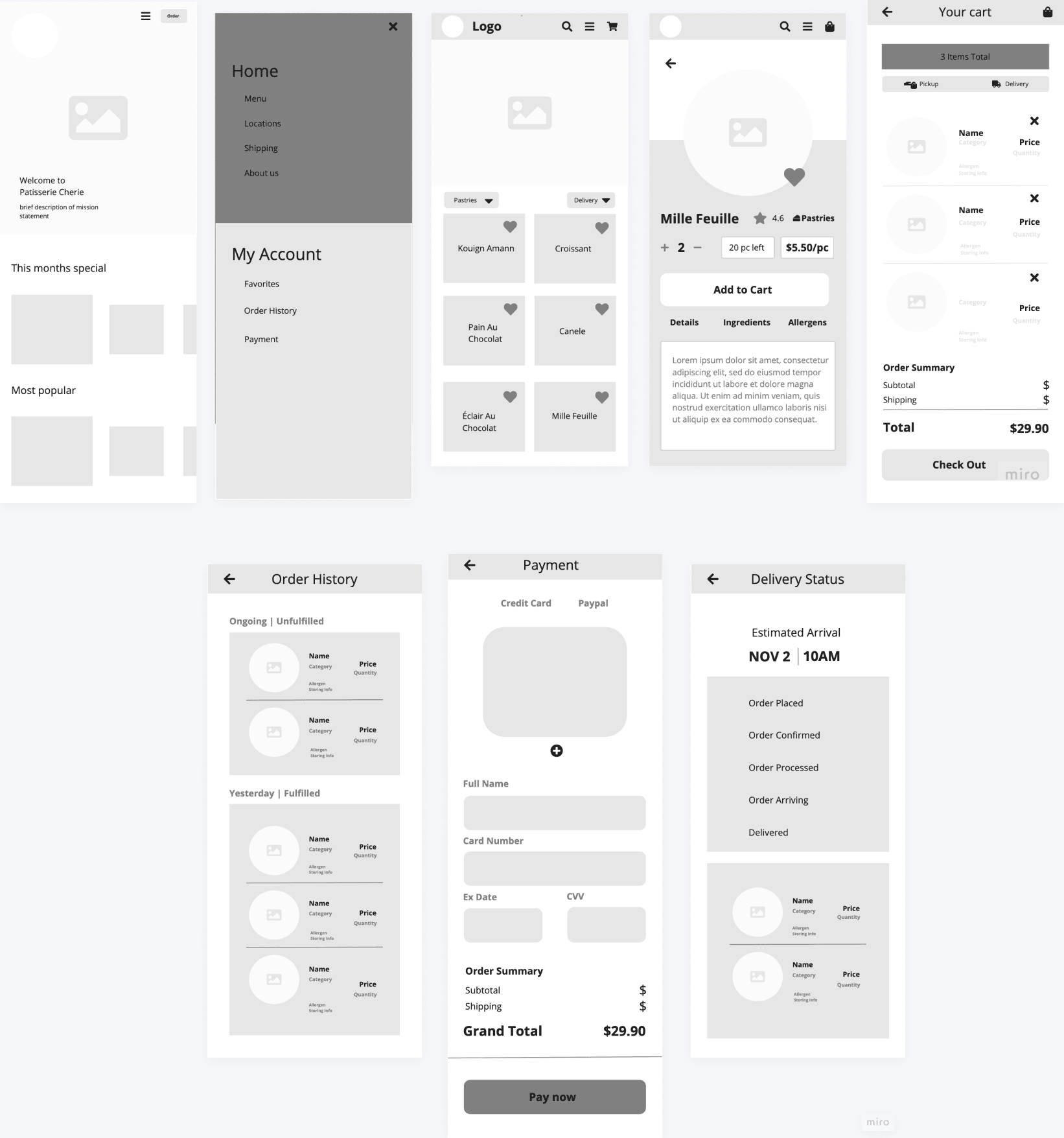
Mid-Fidelity
After the low fidelity's, I moved on to include addtional information like copy onto the screens.
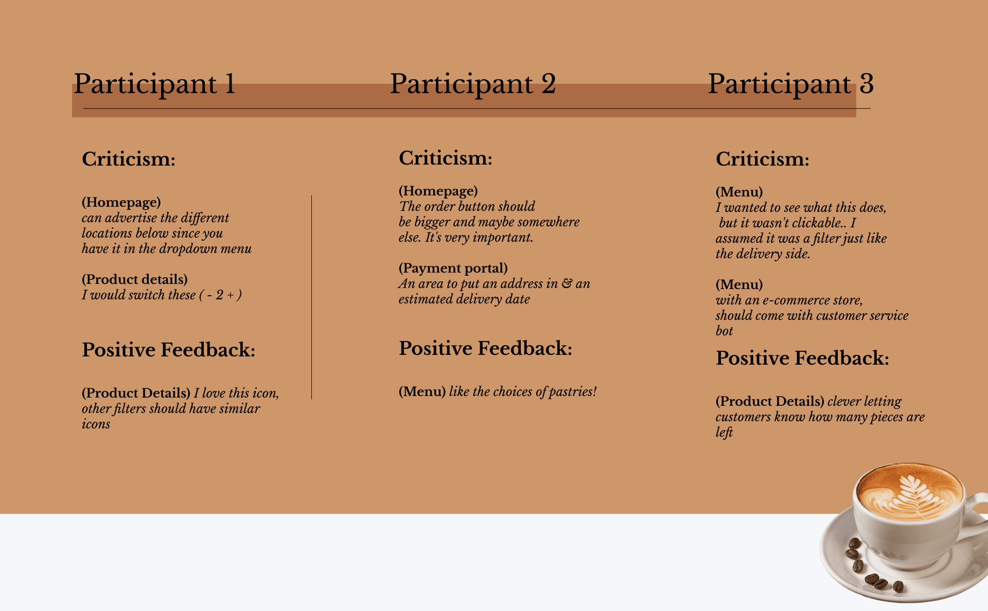
User Testing
After getting some feedback from the user testing of the mid-fidelity screens. There were some features that need to be revised. I found that there were common practices like familarity that need to be included because users were looking for those certain components to be placed where they expected to be. For instance, the order button use to live on the top navigation along with the hamburger menu but some users were missing that button. It's now switched with the hero image.
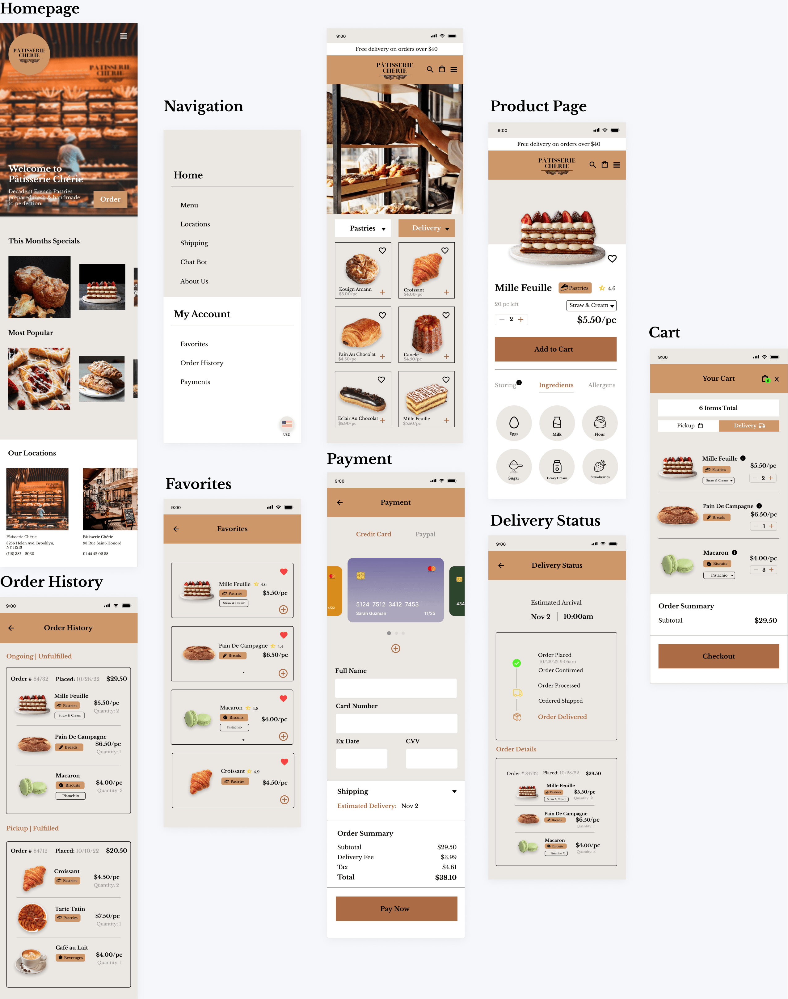
High-Fidelity
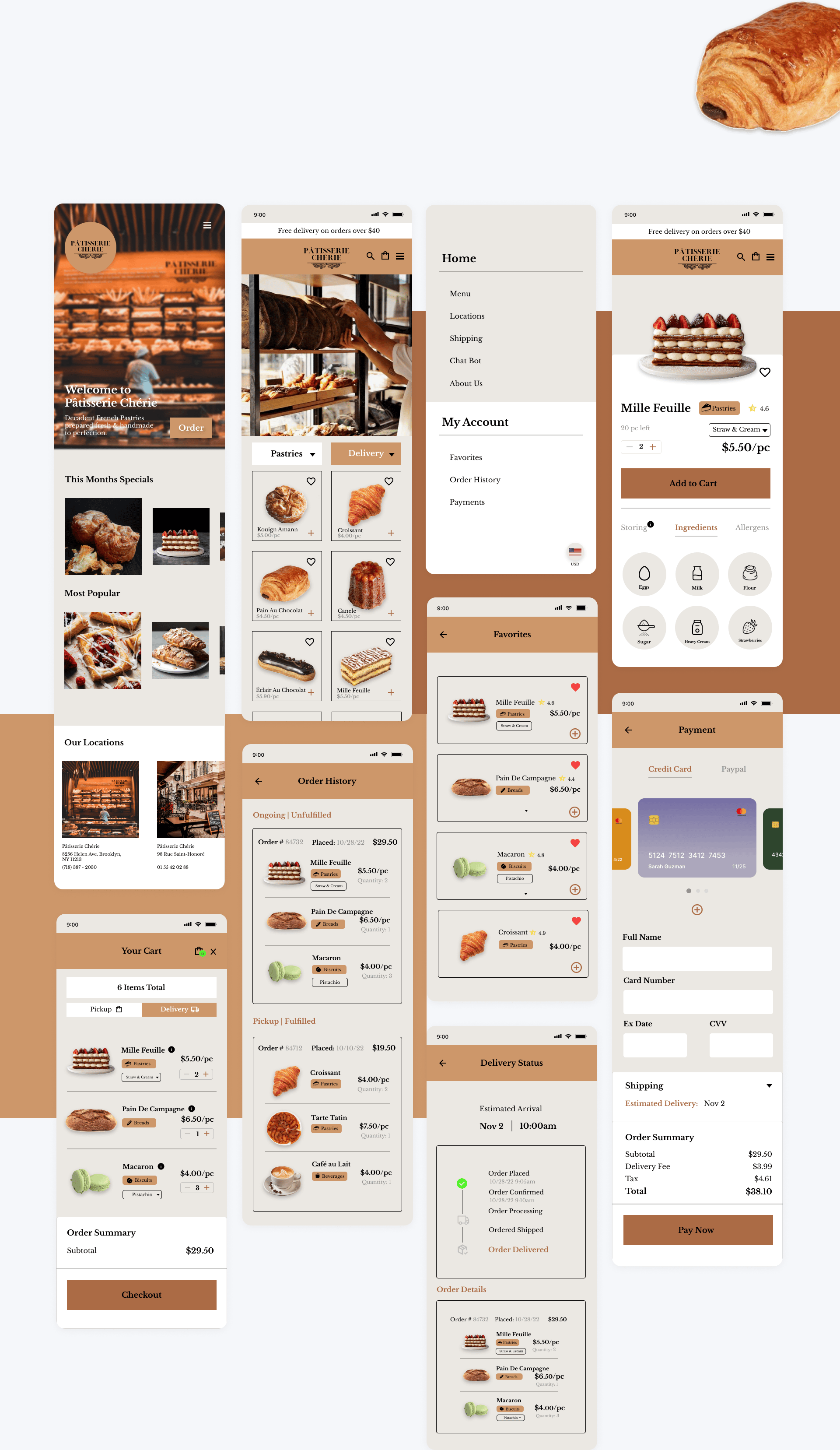
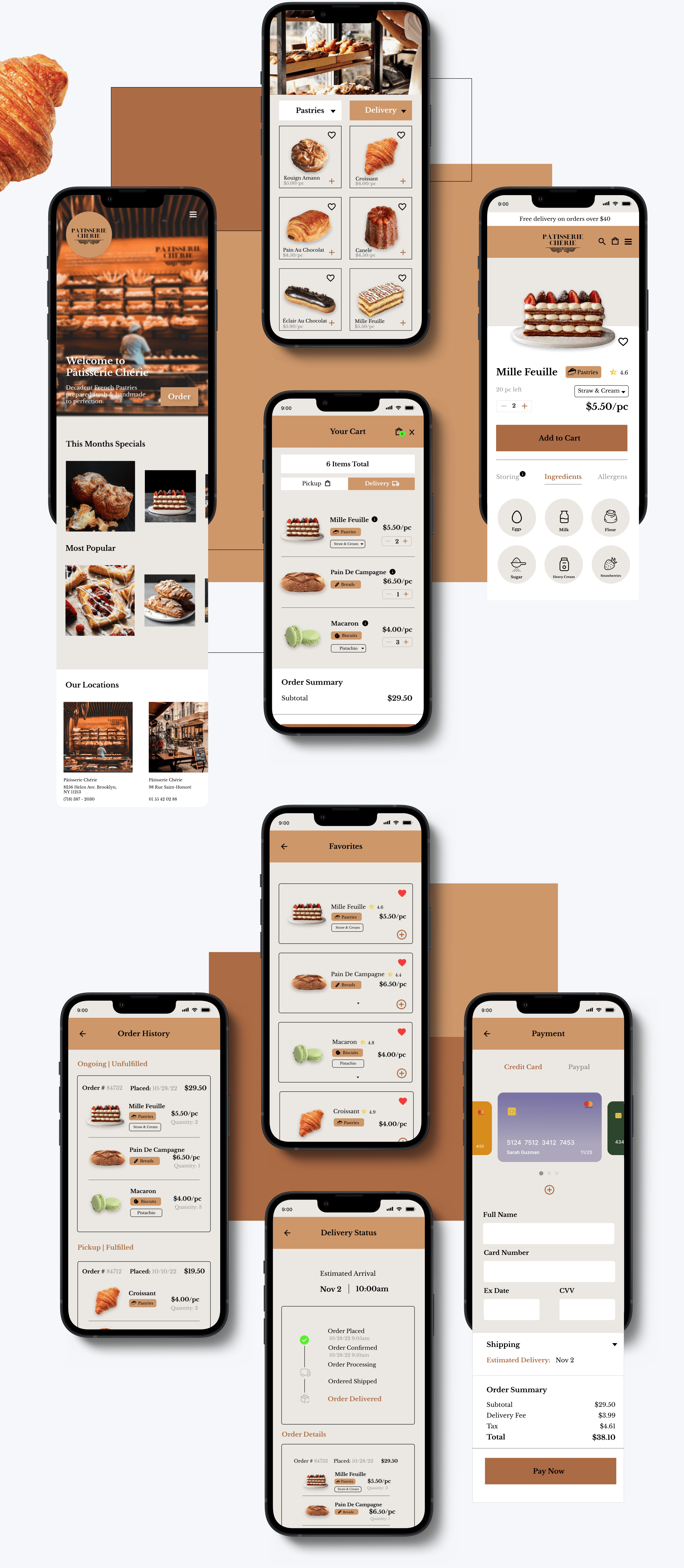
After establishing the visual design components: the brand guidelines with the mission, values, color, tonality and imagery. This is how it turned out. I think it turned out great. I feel the overall branding spoke volumes with what I was invisioning in the beginning that was so abstract. It evokes luxury, decadence and craftmanship through the color choice and imagery.
Final Design and Mockups
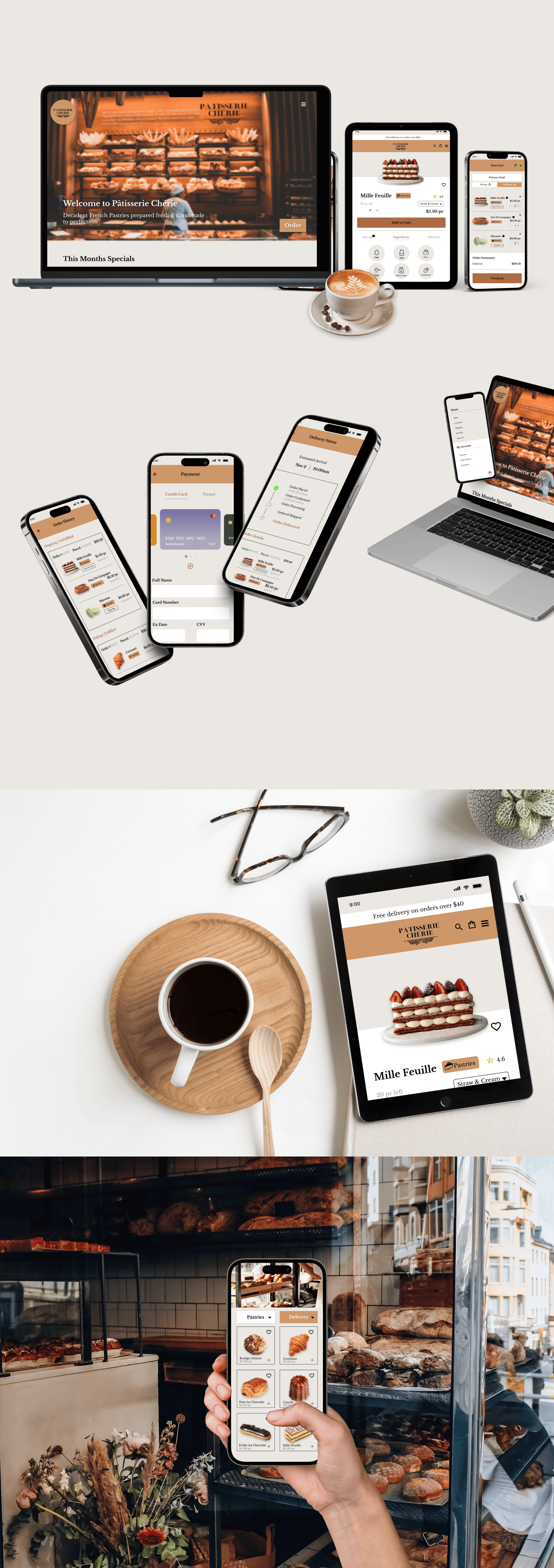
The final design turned out how I invisioned the brand to be.
Retrospective
My thoughts and challenges I’ve faced during this project
Thoughts
This was a very fun UI case study that gone over the fundamentals of brand design and guidelines. Knowing brand guidelines is important as a UI designer because we often work with companies that have their own brand strategy. This project allow me to build a cohesive brand and company from imaginative, abstract concepts. These guiding principles will include anything that alludes to the brand values, personality, mission, and base foundations.
Challenges
The challenge for this project was coming up with a cohesive brand from ideation to end deliverables. Coming up with a brand identity needs to convey the main message of the brand. I was afraid using brown as one of the core color would renounce the luxuryness of the brand but it turned out well.
What I learned
I learned the importance of brand idenity and how to build a cohesive brand from scratch. Having a strong brand document means success for product recognition and promotions. Branding is super essential to UI design especially in case when you want to use the interface as the additional flow of user attraction as well as the way to increase brand awareness. This help develop my user interface skills further allowing me to realize corresponding concepts that support each other.
Prototype Coming Soon