Overview
About Green Means Eco
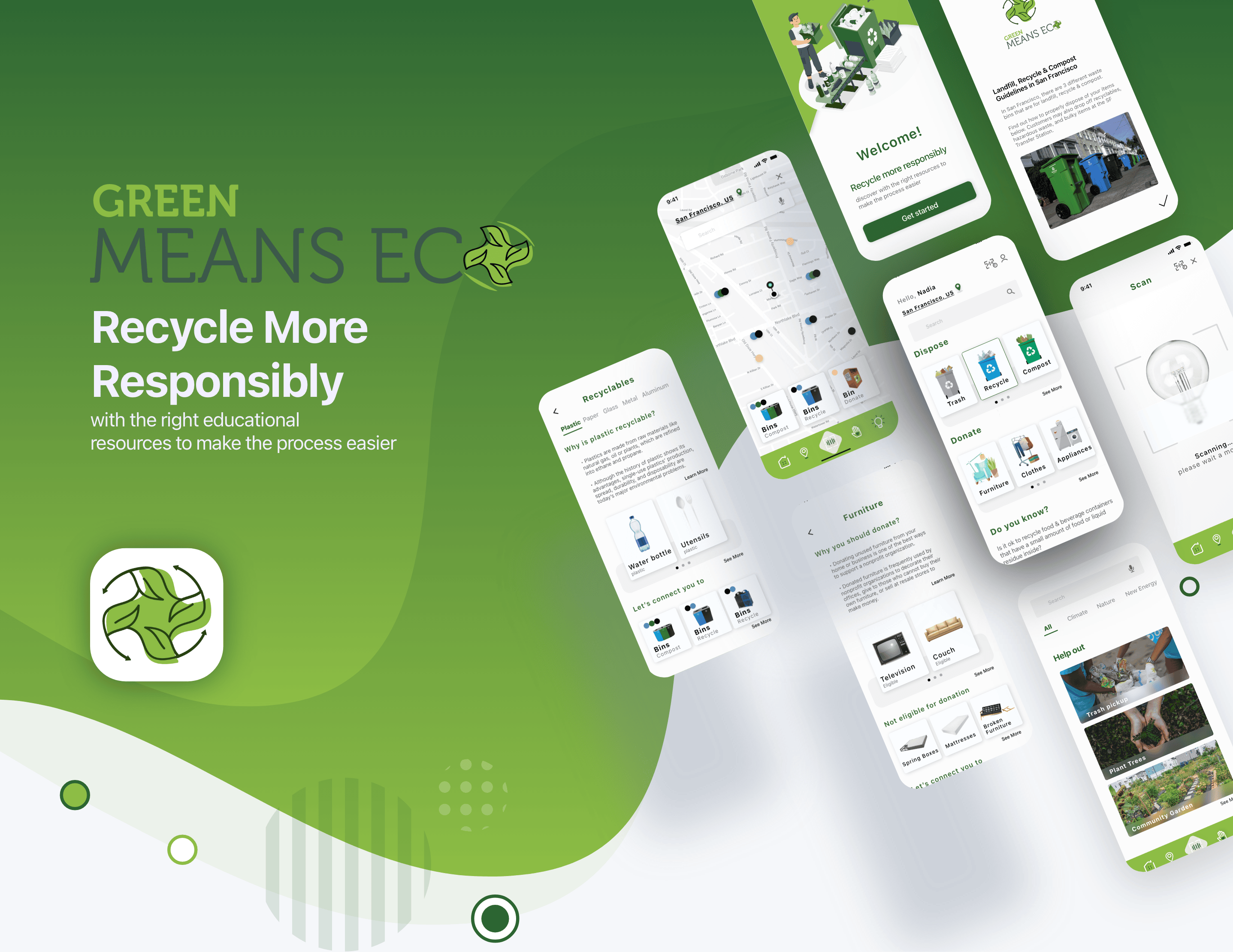
Green Means Eco is a native recycle education mobile app, available in IOS & Android. This product may be best used on mobile because of how instantaneous users need to throw away items.
Problem
Can this item be recycled? How do you recycle, compost, donate, and dispose of items? How do you properly execute this? The insufficient amount of information available is a huge barrier for folks to recycle responsibly.
Solution
Green Means Eco is a solution for users that want to be educated on sustainability, specifically where, what, & how to donate, recycle and compost. And when users are feeling generous, they can give back to the community by volunteering.
Hypothesis
Users want a native mobile app that they can explore resources on recycling while being able to quickly access information on the go on where, what & how to donate, recycle and compost.
Design Process
Discover Phase
Research
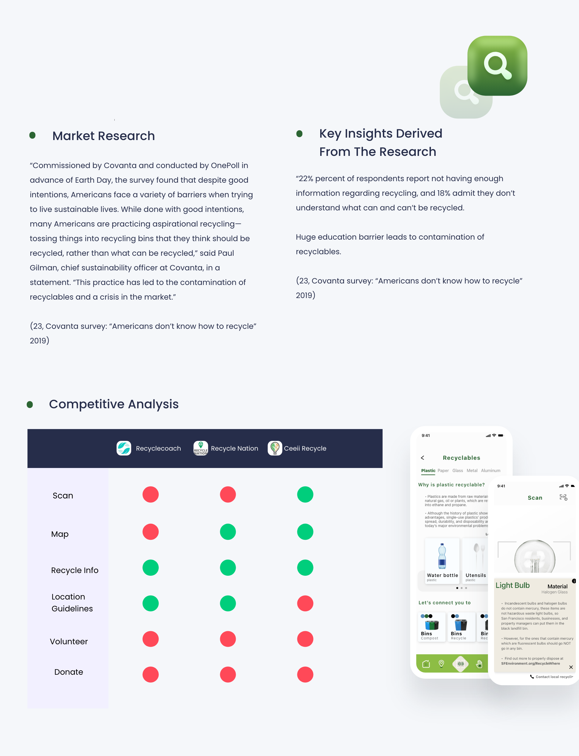
The Market & Competitve Anaylsis
What I've found during the research is that many Americans lack the resources to access adequate information on recycling. In result, it leads to contamination with items not thrown away properly. I wanted to dig deeper and offer these resources for people to learn and explore freely. It doesn't have to be stressful process but a rather useful one.
Define Phase
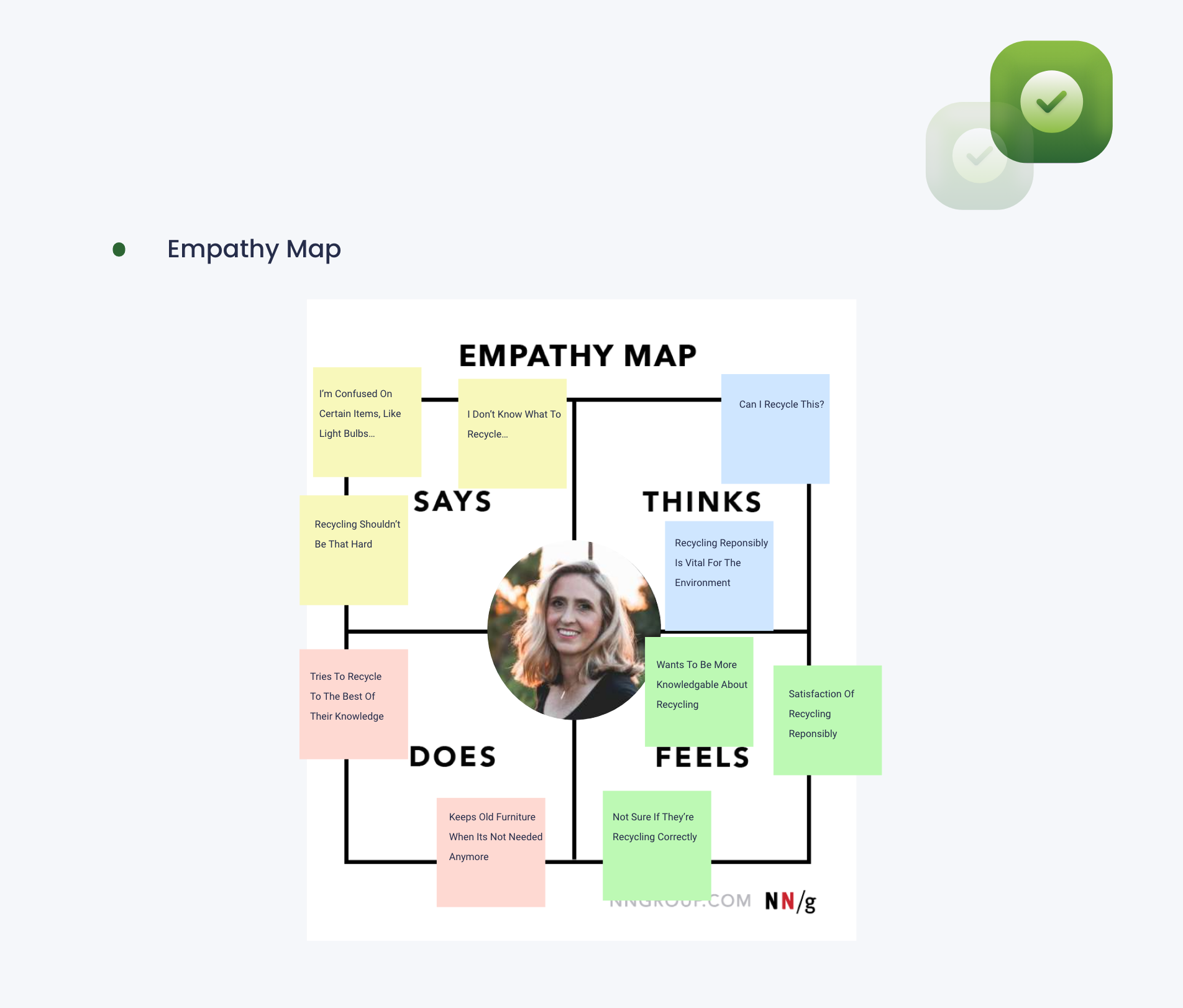
Empathy Map
During the research, I wanted to gain a deeper insight to what the average user would look like, how they would act, why they would use the app. Generally, this represents a group of users.
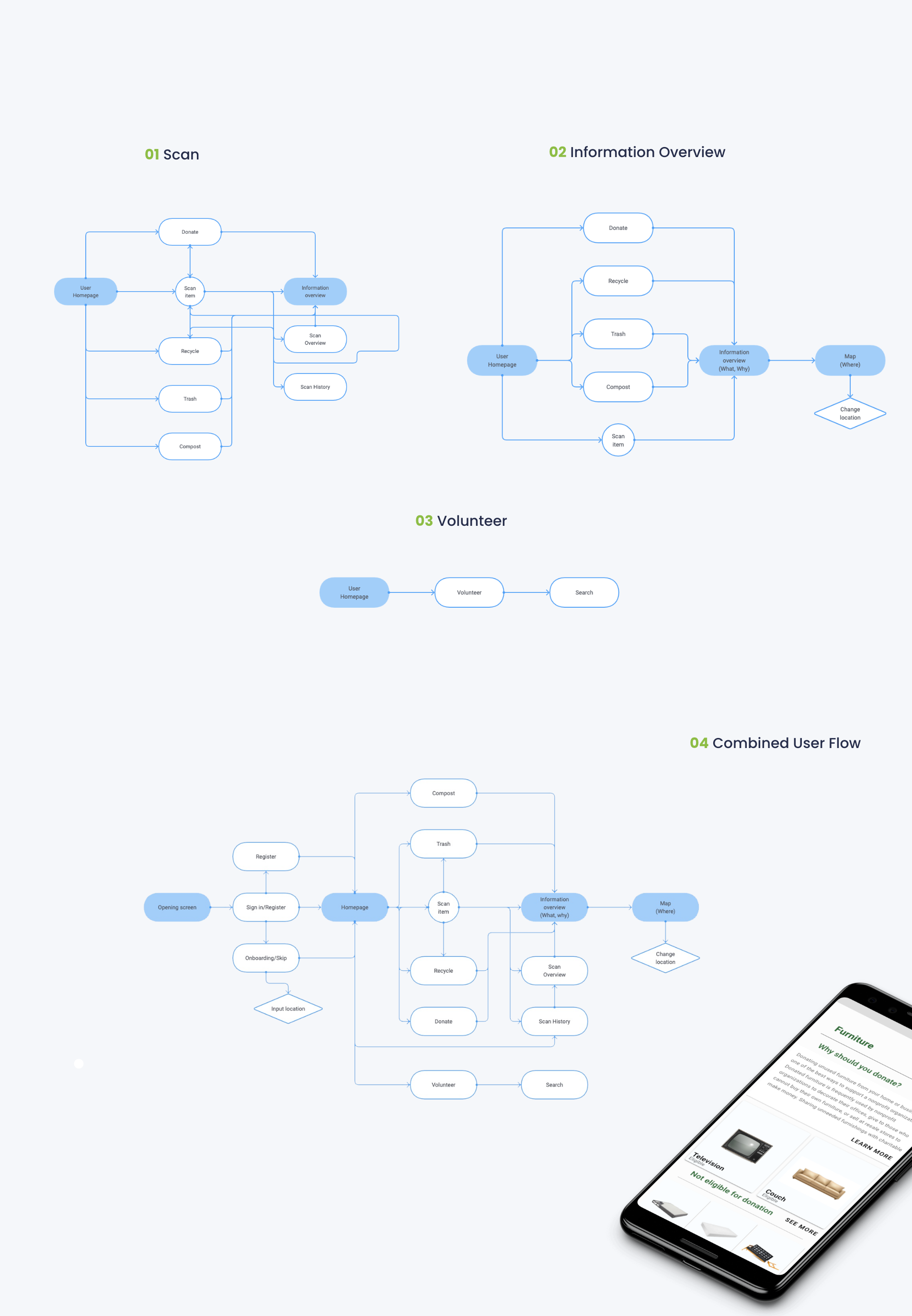
User Flows
I curated 3 different routes that leads to the main features of the app. Note: Please feel feel to zoom in.
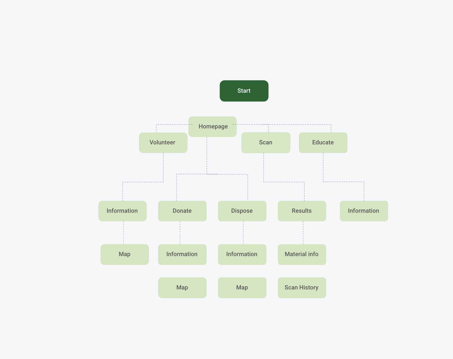
Information Architecture Map
I want to further include a information architecture map that details how the app functions for the user.
Ideate Phase
Wireframes
Low-Fidelity
I sketched the low-fidelity wireframes digitally using the the user flows to ideate 3 main routes users will take to complete a task. These tasks are; users reaching the scan feature, users accessing information overview on subject. Lastly, getting to the volunteer information screen.
The main challenge with curating the flow was figuring out the initial navigation on the homepage. How I wanted to split the search: by item material or the category? i.e. if one should land upon selecting glass of a bulb or if one should select the action of composting? Those were the concerns that I had that I later tested in the high-fidelity phase.
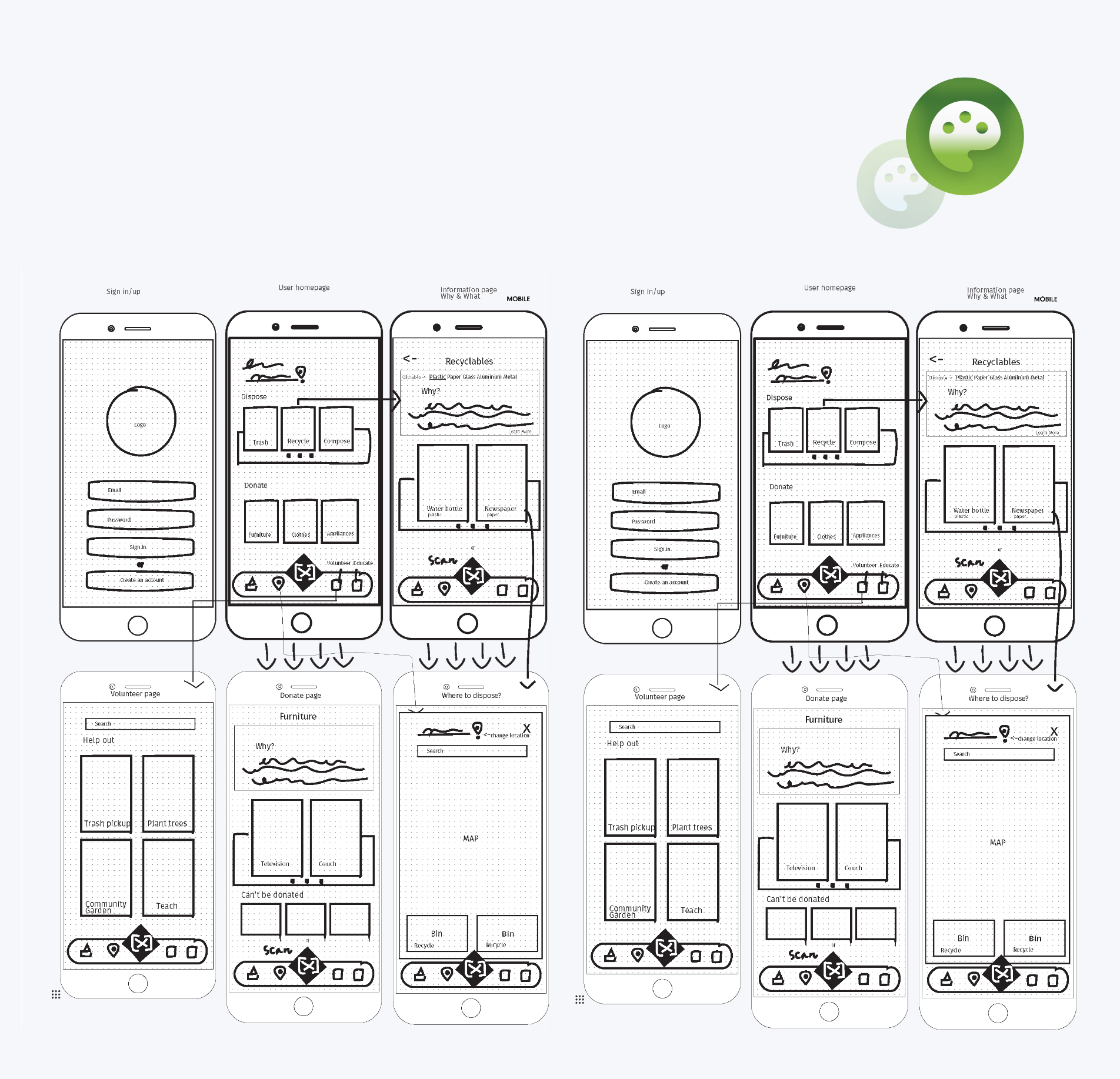
Additional routes & screens were added that weren't accounted for during the sketches: The Map, Scan History.
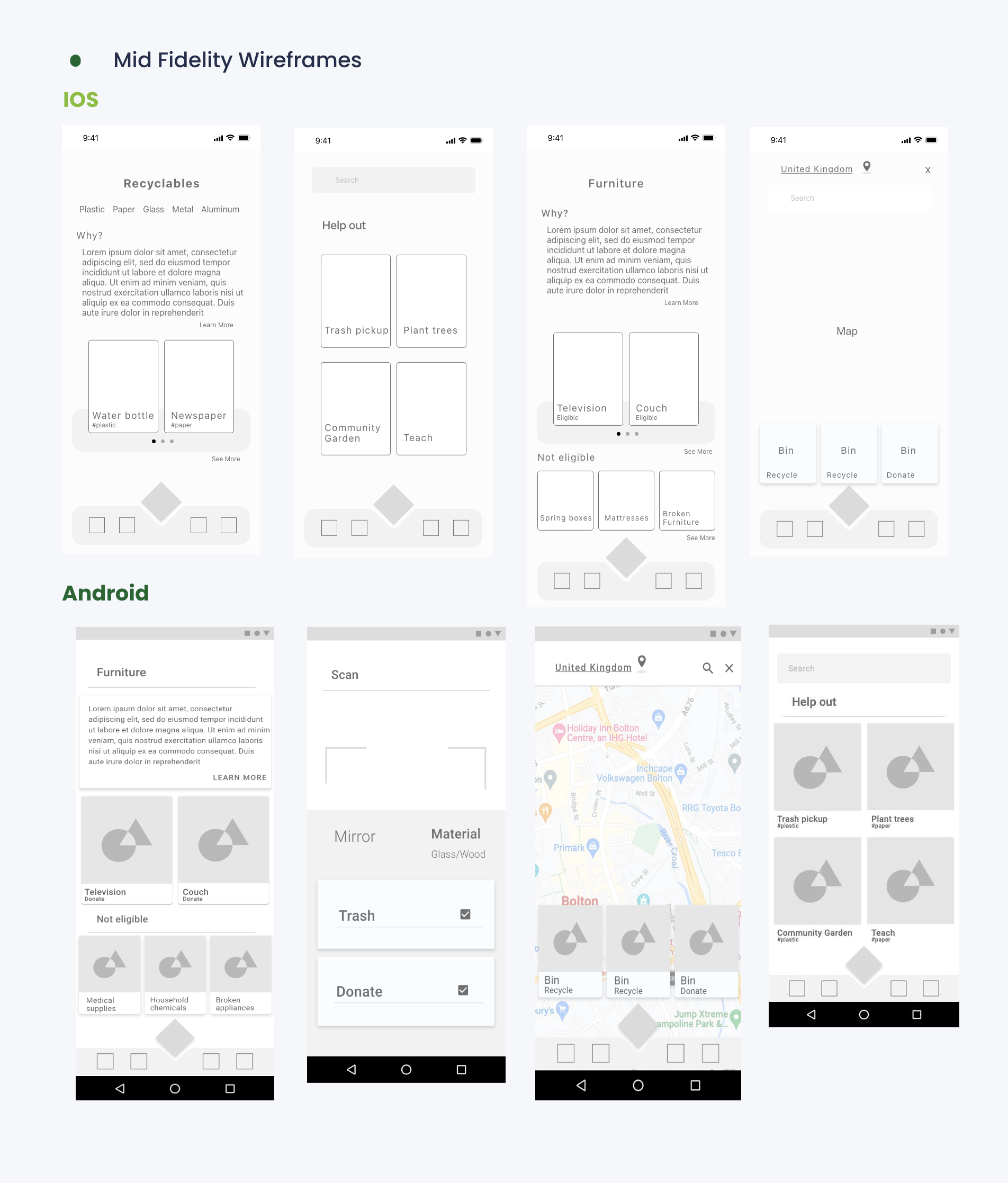
See full versionMid-Fidelity
During the mid-fi's, there were decisions that were made to follow the guidelines accordingly for IOS and Material design. i.e. IOS cards were flat opposed to material, which are heavily shadowed. Note: To see full Mid-fidelity's, click on full version below.
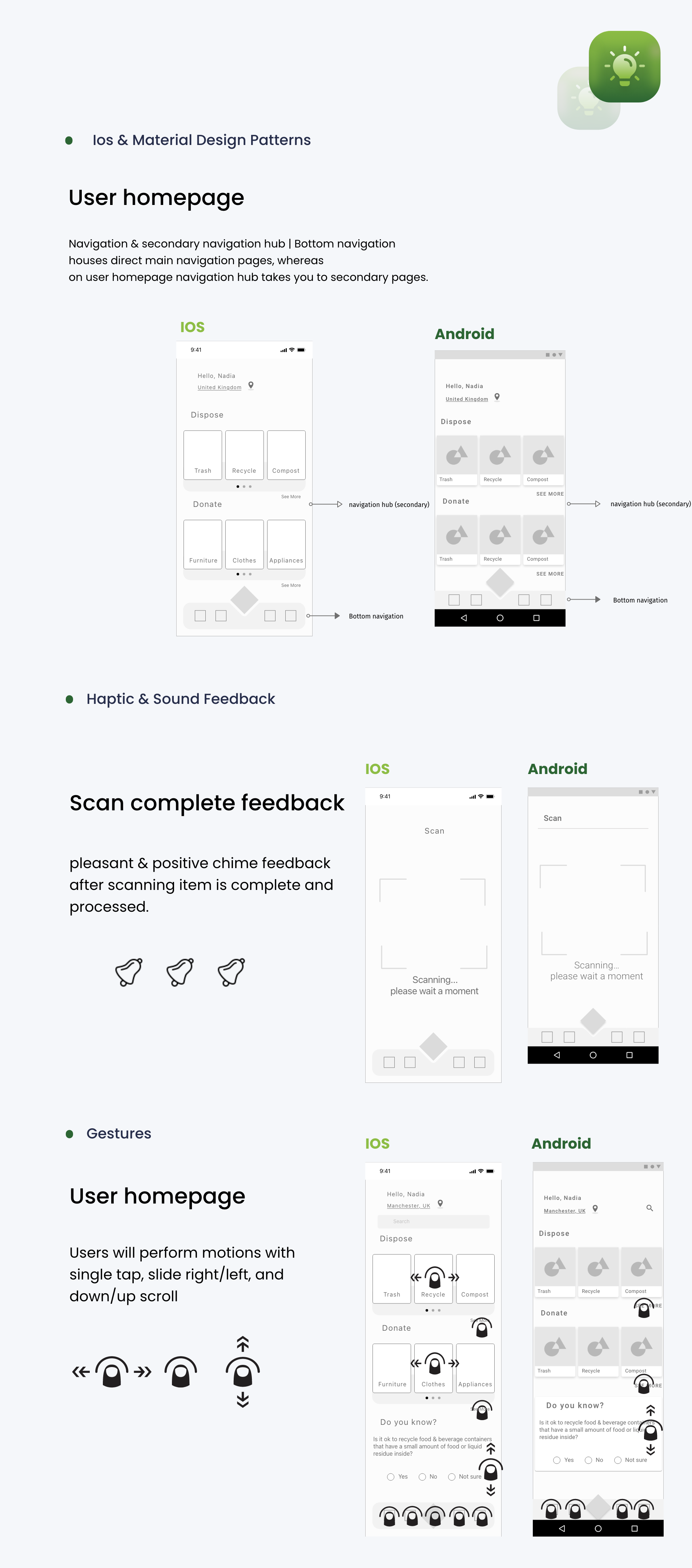
IOS & Material Design Patterns
After the mid-fi's, it was time to identify the IOS and the Material design patterns helped me differentiate their pattern commonalities. Also, it helps me distinguish and develop the structure of the visual hieracrchy while keeping the information architecture the same. This includes Haptic Sound Feedback & Gestures. When designing multiple native apps there are patterns must stay true.
High-Fidelity
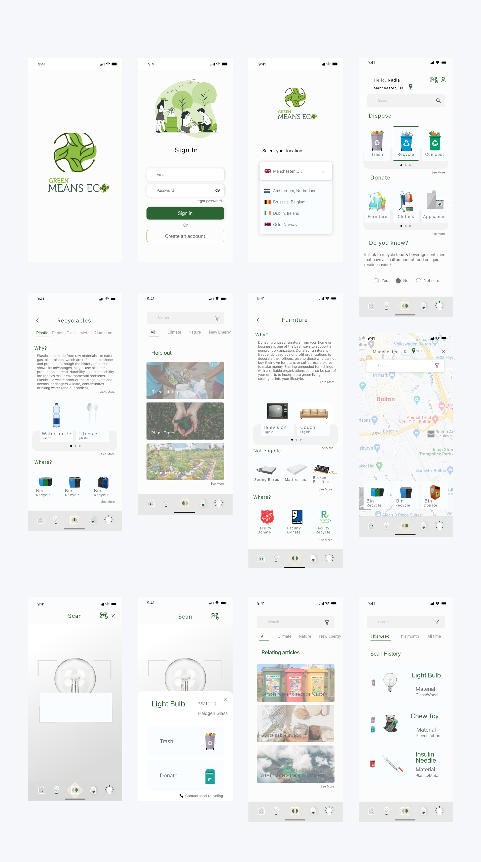
IOS
Another phase of testing was conducted with mid-fidelity wireframes through prototype with 3 participants. There were more user pain points I’ve found. The wireframes below are modified based on the mid-fi’s.
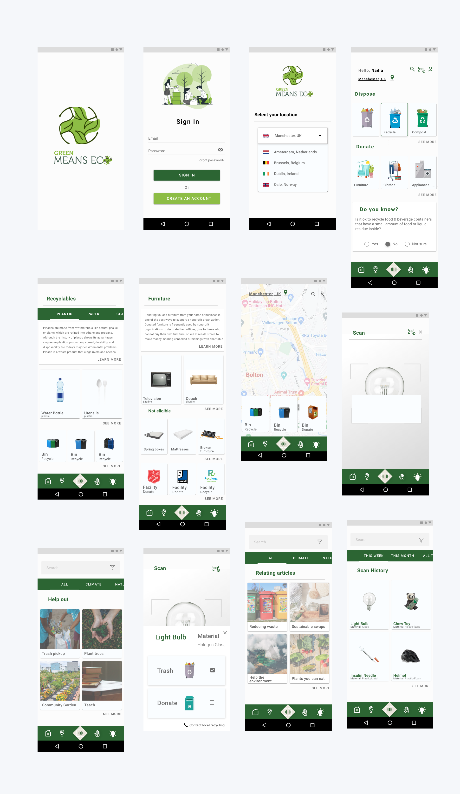
Android
Usability Testing
After high-fi's were designed, prototype tests were conducted with 5 participants to measure the accessibility with the user experience and visual design.

After the critiques, another round of iteration is done to finalize the high-fidelity frames of the devices. This will be shown during the final design.
Visual Design
Style Guide
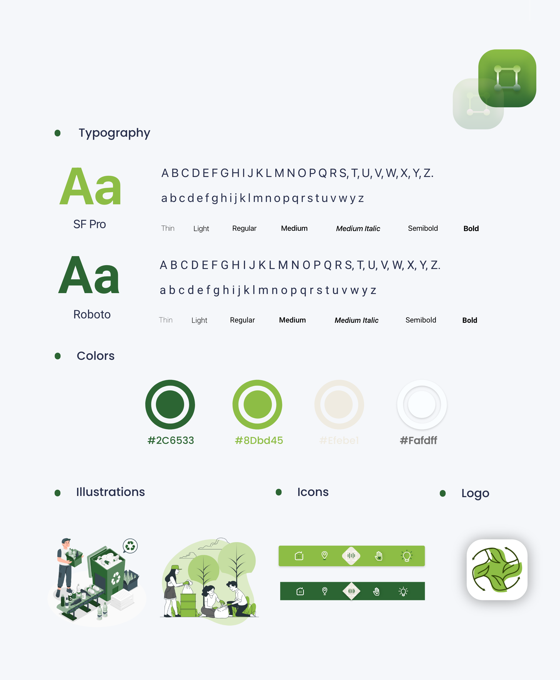
Adhereing to the guidelines, I used SF Pro font for IOS and Roboto for Android. I carefully picked out the light green tone for IOS and darker green for the Android.
Product Features & Final Designs

Retrospective
My thoughts and challenges I’ve faced during this project
Thoughts
I wanted to design an intuitive app that anyone with a learning mind can follow. I want to include features where they could freely explore, be educated on how to recycle, while using it quickly on the go with the scan & search bar. My initial assumption on the homepage, the main navigation was going to be categorized by items instead of have it be dispose, recycle, & compost. I believe it worked out great so far because I wanted to slow the pace of the learning process down without eliminating the quick scan function. This is more than a resource platform, I want it to be educational, where the user could spend a bit more time on the categories.
Challenges
Challenges I’ve faced was determining the main navigation on the user homepage. If I should've categorized the menu with materials instead of trash, recycle and compost. However, it made sense for user to explore and spend a bit more time knowing these main categories first because they had other quick features to look up item if need be.
What I learned
What I learned about this project was the distinctive, unique guidelines to follow for IOS & Material design. There were a chunk of usability and visual elements missing before the usability testing phase, and I learned so much from the interviews.
