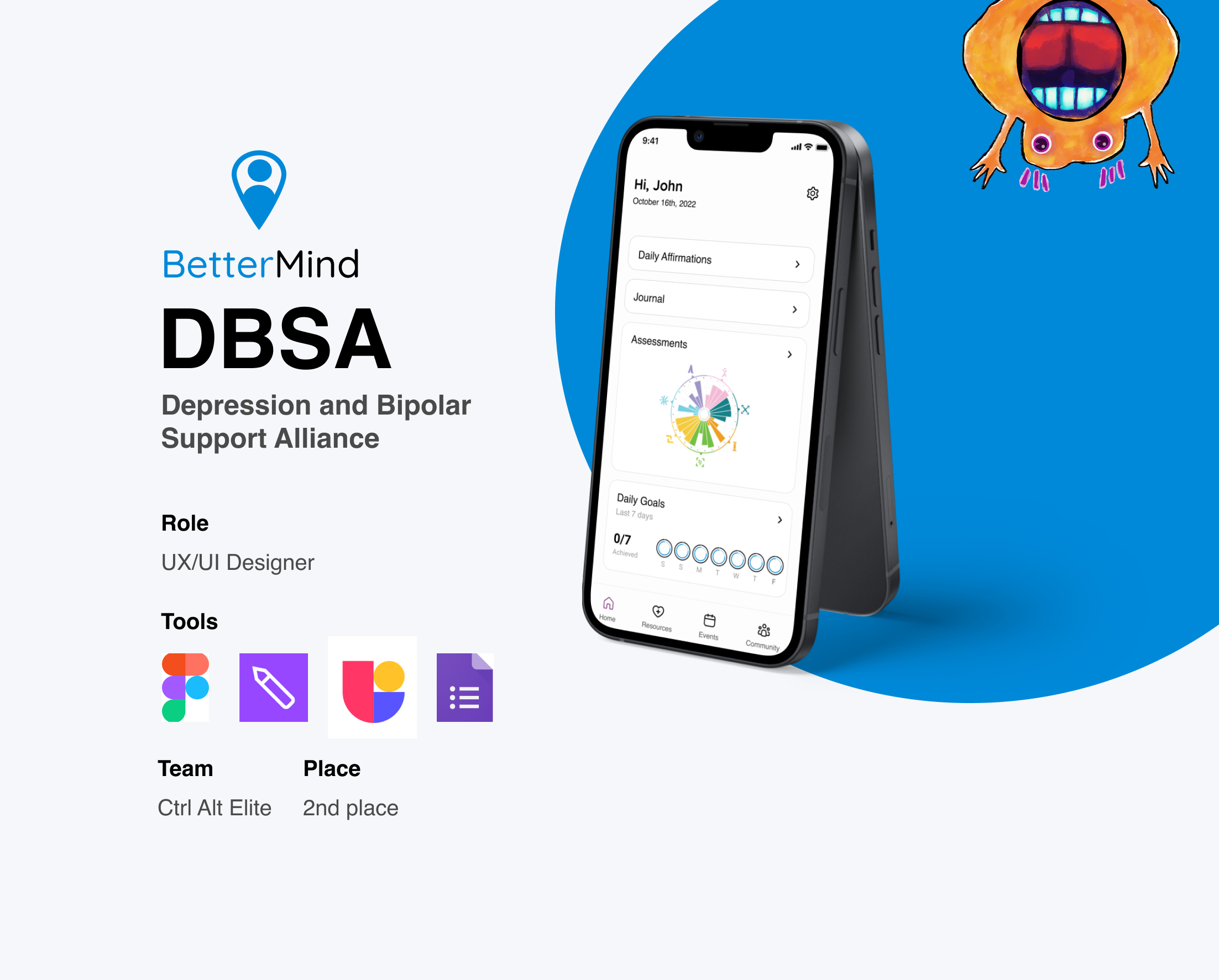
Overview
Overcoming sleepless nights, our team embarked on a pursuit to conceive an innovative solution that would make a lasting impact. Join me as I share the exciting journey of our intense 3-day sprint and how we surpassed expectations and secured a 2nd place position. Here's how we did it:
Check out PrototypeThe Problem..
According to the CDC, more than 50% of Americans will be diagnosed with a mental illness or disorder at some point in their lifetime. With the rising costs of healthcare and a shortage of therapists, many people move through life untreated or even diagnosed. A growing number of individuals find themselves navigating life without the necessary support, lacking access to essential treatments, or just simply not knowing who and where to reach out to. When mental health resources are affordable, it means that anyone, regardless of their background or how much money they have, can get the support they need. This helps break down the stigma around mental health because people feel like they can actually reach out for help without worrying about the cost. We have to tackle this problem by making mental healthcare services more affordable, accessible, and raising awareness. We must ensure that everyone can focus on their well-being journey without being left behind.
How Might We..
Motivate people to track their mental health, make changes to improve it, and find relevant resources, while being accessible?
Design Process
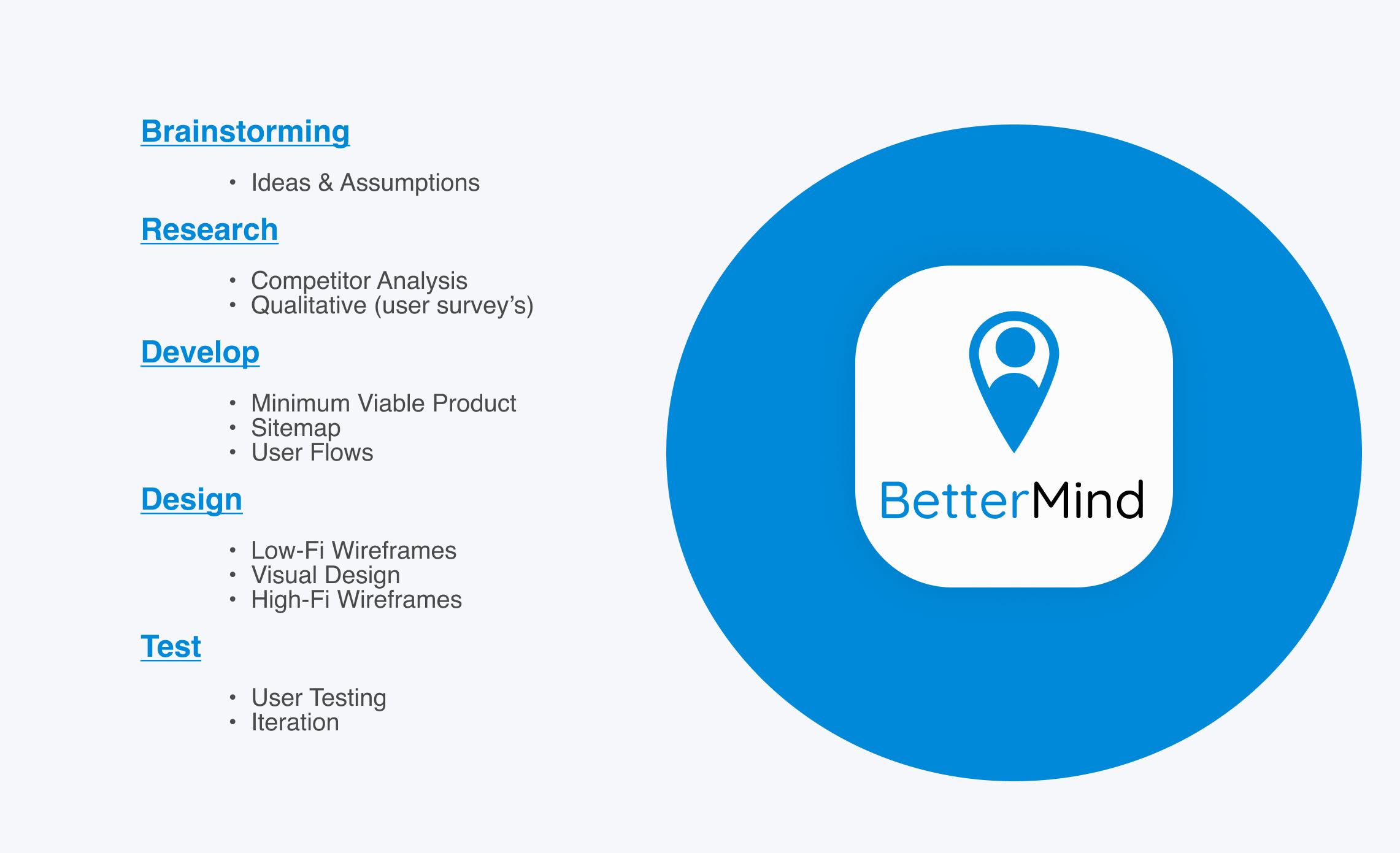
Brainstorming
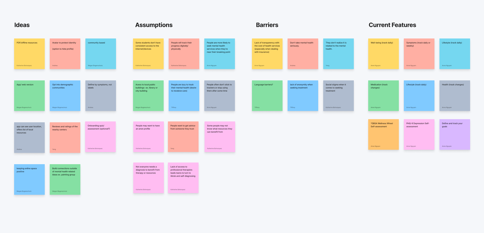
Idea vs Assumptions
I went through 3 hours of brainstorming for the best possible, feasible product features that could serve this problem challenge: How might we remove the barrier of cost and access to care, and empower all individuals to self-manage their mental health? (DBSA)
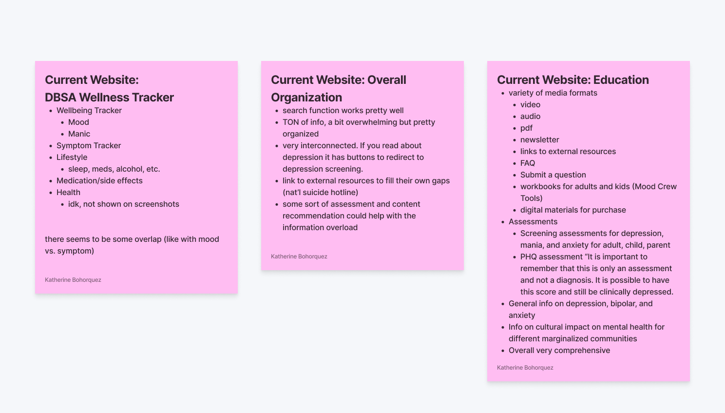
Firstly, I evaluated DBSA's existing website and product features to understand their resource priorities. I identified opportunities to add missing elements and suggested improvements for enhancing their overall offering. My team and I then created a comprehensive plan outlining the implementation of these features, keeping in mind the user experience and technical feasibility. Feel free to zoom in.
Research
Competitor Analysis
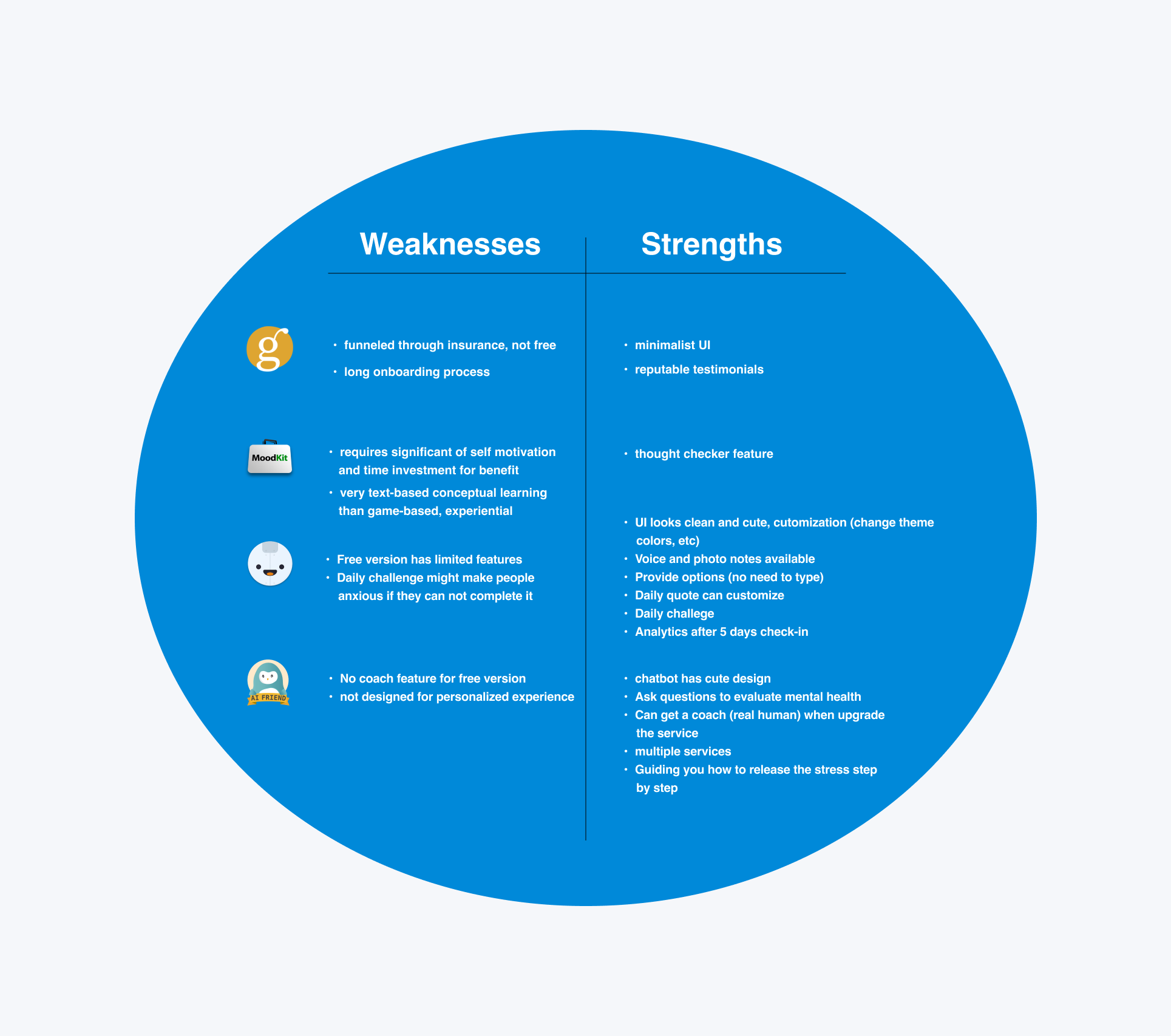
I conducted competitor research to understand what is currently available in the market. The strengths & weaknesses of these companies: Ginger, Moodkit, Wysa AI Chatbot, Reflectly. This is what I found.
Qualitative Research
Furthermore, we conducted user interviews and surveys to gather insights and validate our design decisions, ensuring that the proposed changes resonate with the needs and preferences of the target audience. This iterative approach allowed us to fine-tune our solutions and ensure a user-centric approach to addressing the challenge. These are the painpoints and opportunities that we gathered:
Using the painpoints and opportunities that we've gathered through the survey's. We then developed the MVP document.
Develop
Minimum Viable Product
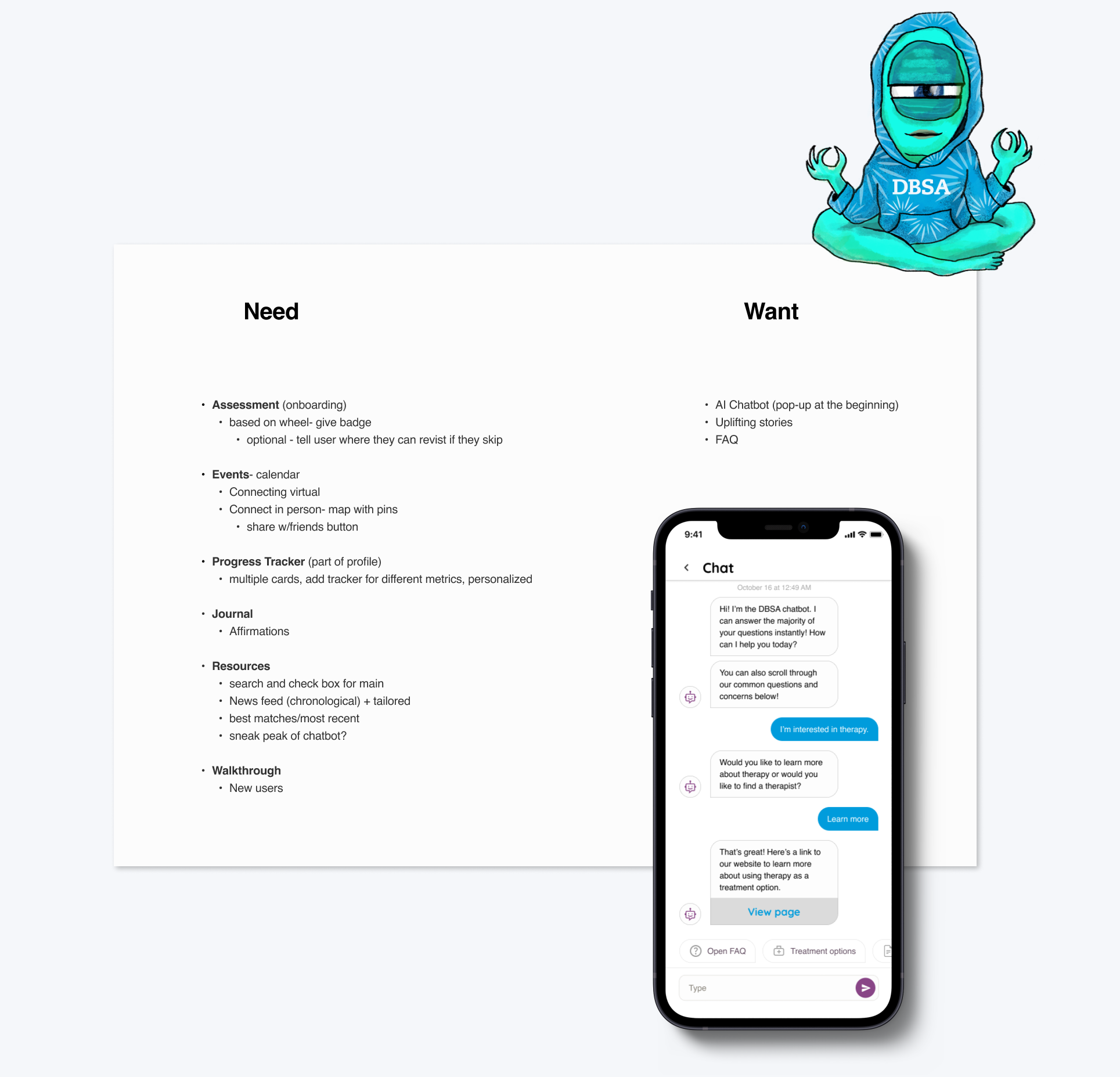
We categorized the narrowed-down product features into essential needs and additional wants for the app. Our primary focus was on creating a personal portal that enables individuals to access mental health resources while also offering a comprehensive set of additional features, all conveniently available within a single app.
I was all for the AI chat-bot as an interesting addition to the features because it could provide users with real-time support and personalized interactions, enhancing their overall experience with the app. Moreover, integrating AI technology aligns with current industry trends and can potentially attract a broader user base looking for innovative mental health solutions.
Our Solution
Once we delved into the MVP documentation: the wants vs needs, sorting them by priority, we conjured up this groundbreaking solution that not only puts innovation in the forefront but also puts accessbility and affordabilty front and center with its cool features. We want to stretch the importance of maintenance with our users. So we came up with this application called: BetterMind
About BetterMind
BetterMind is a mobile app with a personal portal for DBSA (Depression and Bipolar Support Alliance). Taking the extensive resources provided by DBSA and tailoring to create a more personal, comprehensive and accessible platform for potential users.
It’s easy to feel helpless when the most well-known resources are out of reach. Better Mind compiles resources at no charge and offers education and options to those who don’t know where to turn. Knowledge is power and giving those suffering with poor mental health puts the power back into the hands (and minds!) of its users.
Site Map
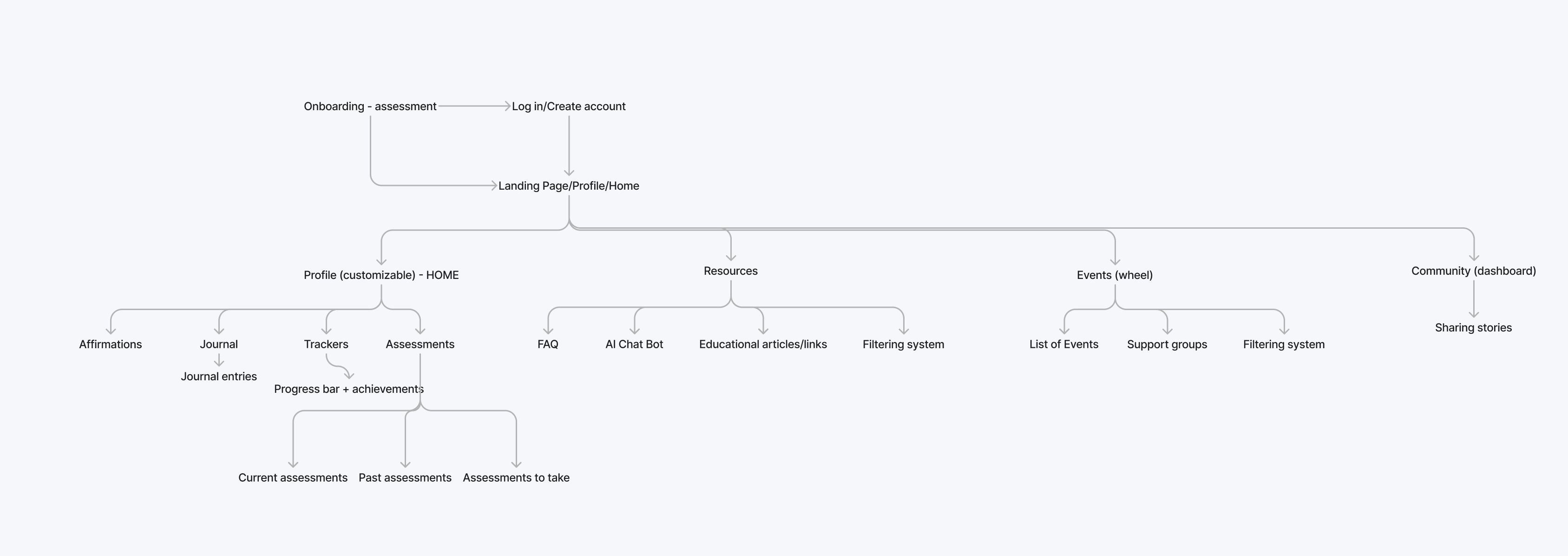
After the development of the MVP and finalizing the solution, my responsibility entailed designing the flow and wireframes for the onboarding process, personal assessments, and the landing homepage. I ensured a seamless user experience through intuitive navigation, aiming to make an impactful platform for mental health self-management.
User Flows
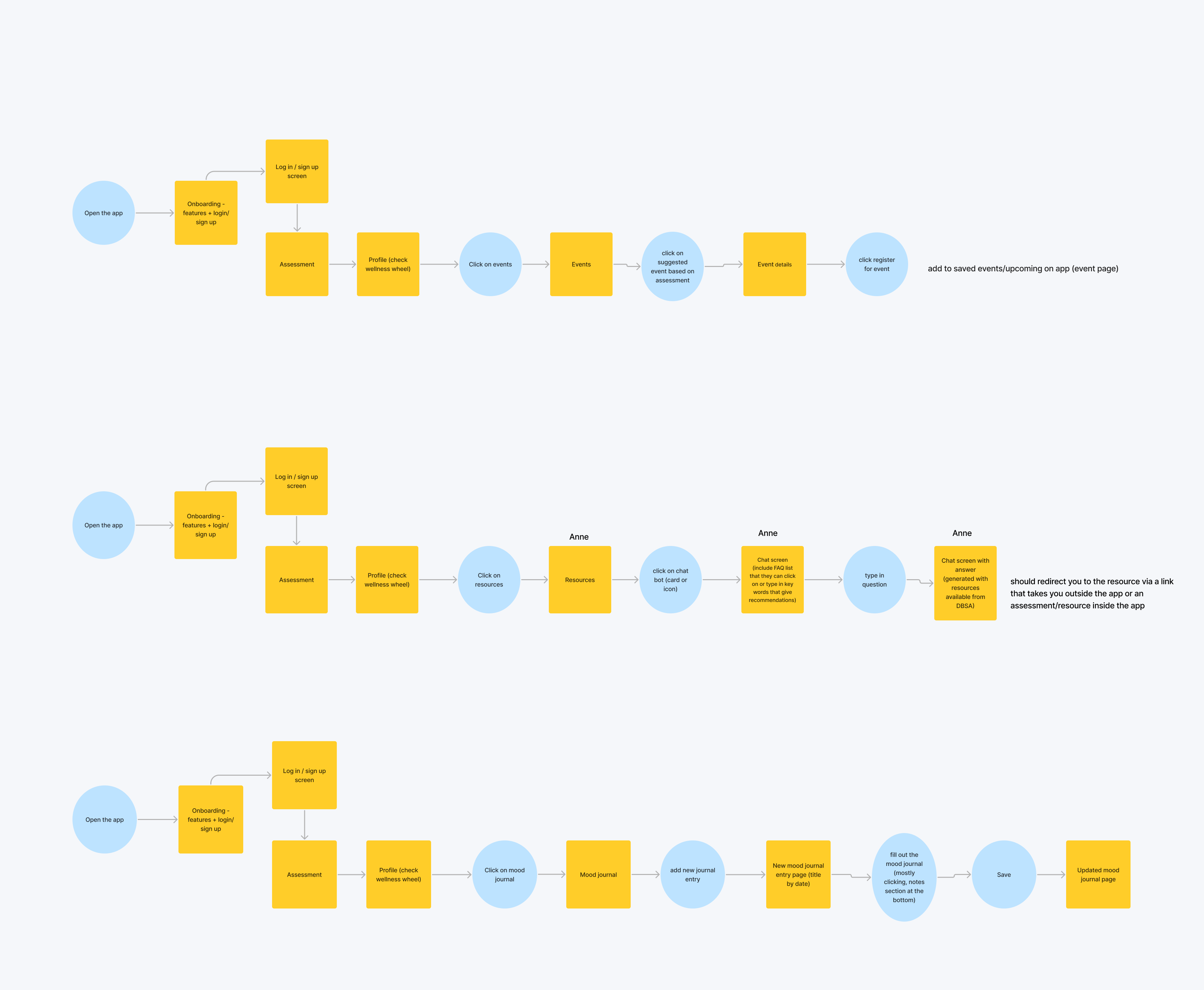
Each flow we created corresponds to a specific task or goal that users need to accomplish, such as event registrations, accessing resources, and maintaining their mood journal.
The primary challenge in curating the flow was finding the right navigation approach, aiming for easy accessibility and clarity of all features. To address this, we incorporated an early onboarding process to highlight the app's benefits to users while ensuring not to overwhelm them with information. This thoughtful approach ensured a seamless user experience and increased user engagement with the app.
Design
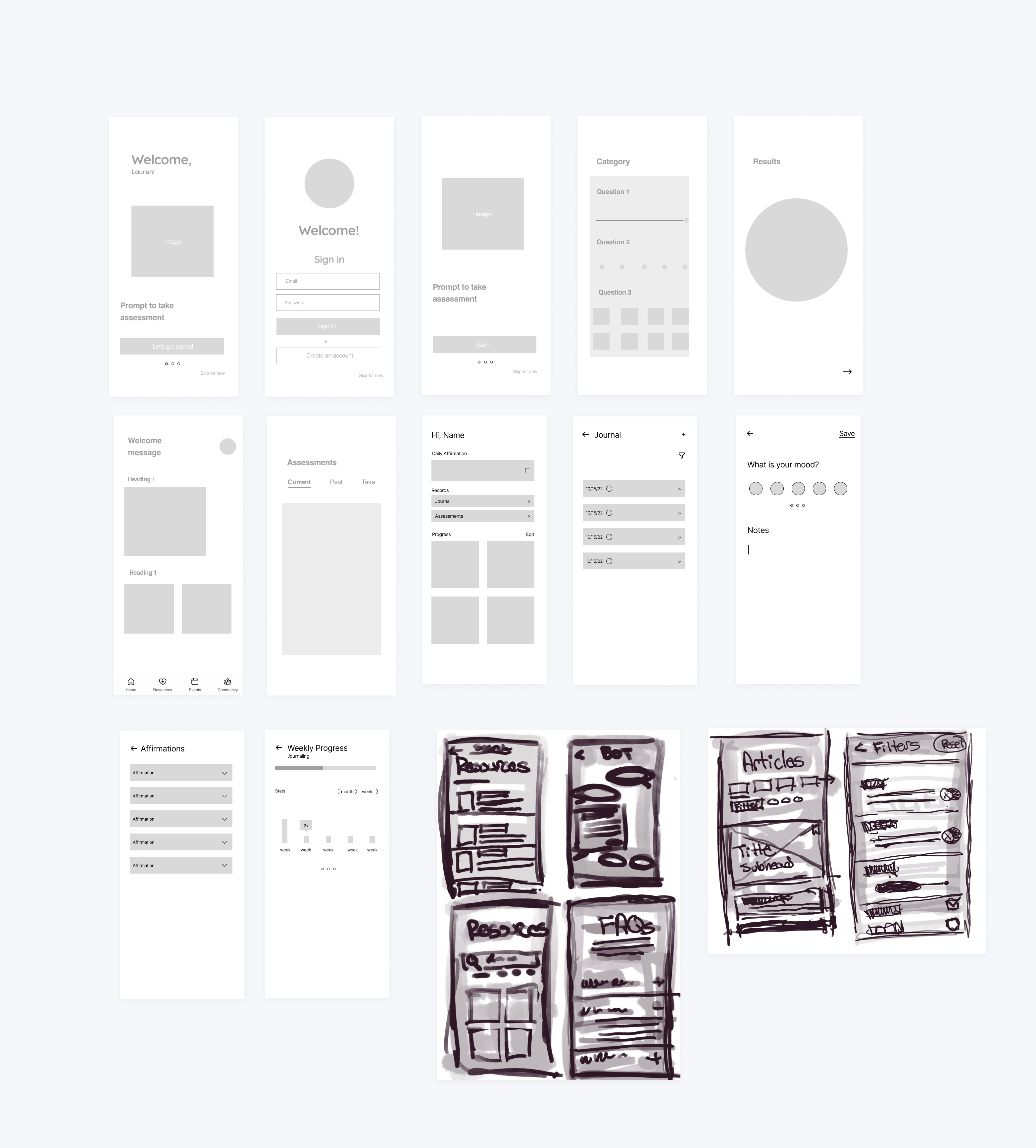
Low-Fidelity
My specific responsibility for the wireframes is the onboarding, personal assessment, and user homepage.
Visual Design
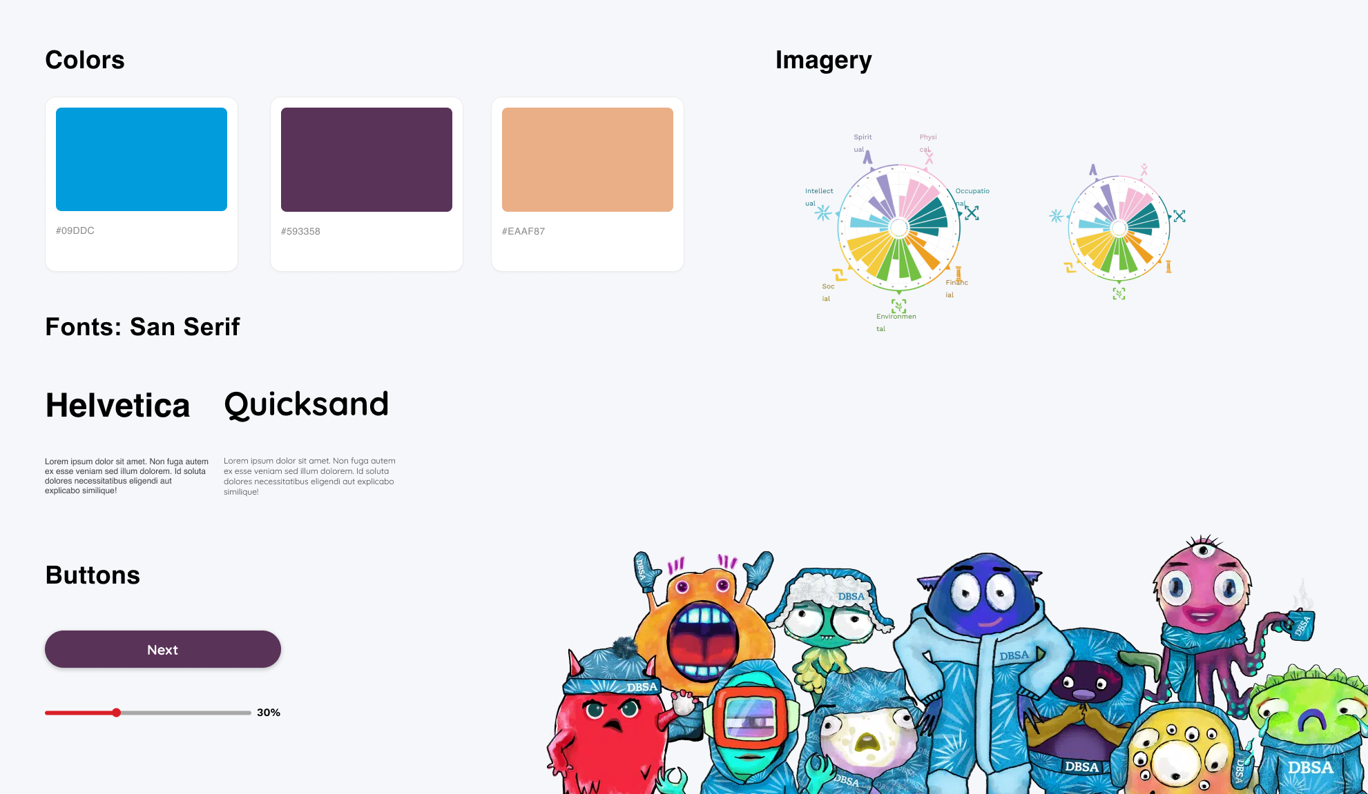
We opted to maintain DBSA's color scheme and incorporate their friendly icons to stay consistent with their branding. For the typography, I chose a heading font that exudes a friendly and inviting feel, while the body font was set to Helvetica for its simplicity and easy readability, being a clean san serif option.
High-Fidelity
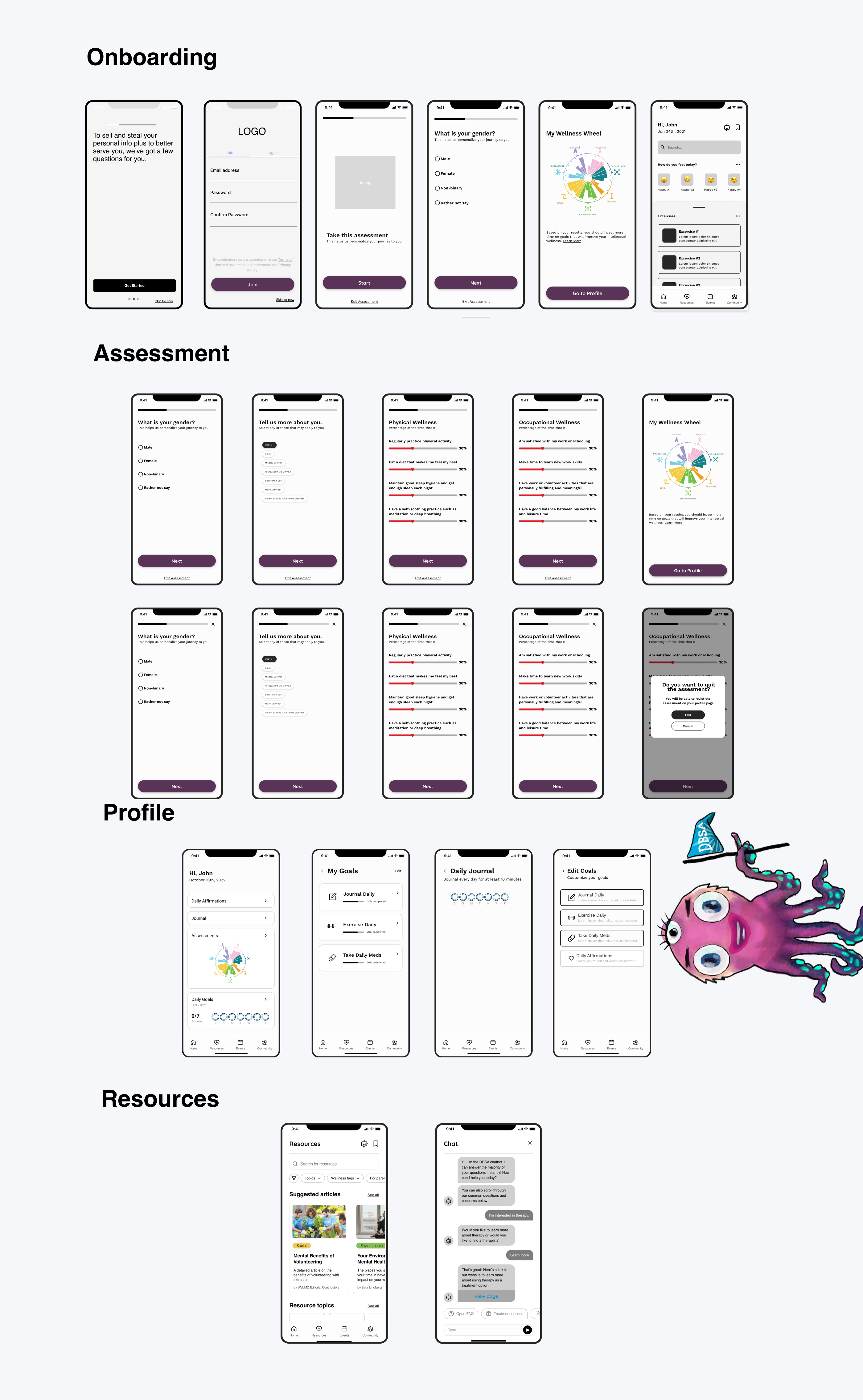
After getting the low-fis & the visual design down. We got a sense of how the app is mapping out, we hopped into designing the final designs.
Testing
User Tests
After the high-fidelity's, we created a prototype to send out to participants of the testing phase to try the app out. We found that this app is jam-packed with features and it might be quite confusing. So, we decided to add a few extra screens in the onboarding process to help them get started with the app seamlessly. As a result, user feedback indicated improved app comprehension and smoother navigation.
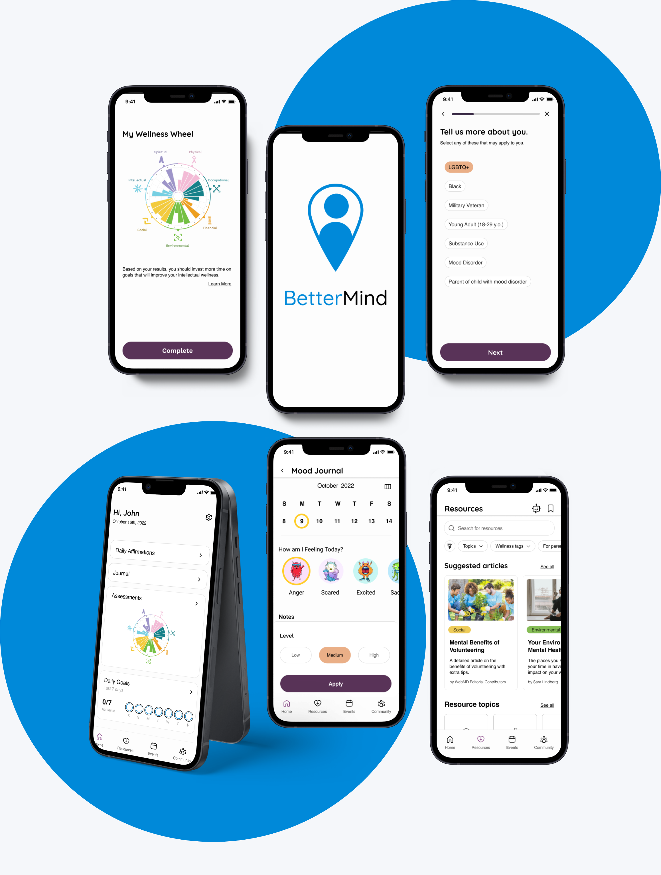
Final Designs
Retrospective
My thoughts and challenges I’ve faced during this project
Thoughts
Working on this project with a team was an amazing experience. I learned a lot during the hackathon, especially about collaborating with diverse perspectives and skillsets. Despite facing obstacles like time constraints and different time zones, our group developed a strong proposal by combining existing resources with new functionalities, tackling the issue from its source.
Challenges
It was challenging having such little time with each of the project deliverables. However, the most time that we took is getting the brainstorm and research down. You only get one chance to try to solve the problem statement. So, we made sure we were all on the same page. Because we were on different timezones, we divided up the tasks accordingly. Throughout the project, the Girls in Tech community provided valuable support and inspiration, contributing to the overall positive experience. The hackathon taught me the importance of adaptability and teamwork in overcoming challenges and delivering impactful solutions.
What I learned
Participating in the hackathon was a tremendous learning experience, as it taught me strategic problem-solving from different angles. Additionally, collaborating with my teammates and learning design techniques brought me great fulfillment, allowing me to be part of this awesome design community.
