Overview
How it started
Before deciding to leave my dog at home alone, once again, I thought to myself, why can’t I just bring him? I’m pretty sure there are many places that are dog-friendly. But, do I want to guess or do I want to be sure?
There must be an ubiquitous platform out there that can get me a definitive answer to all my questions.
About Fetch
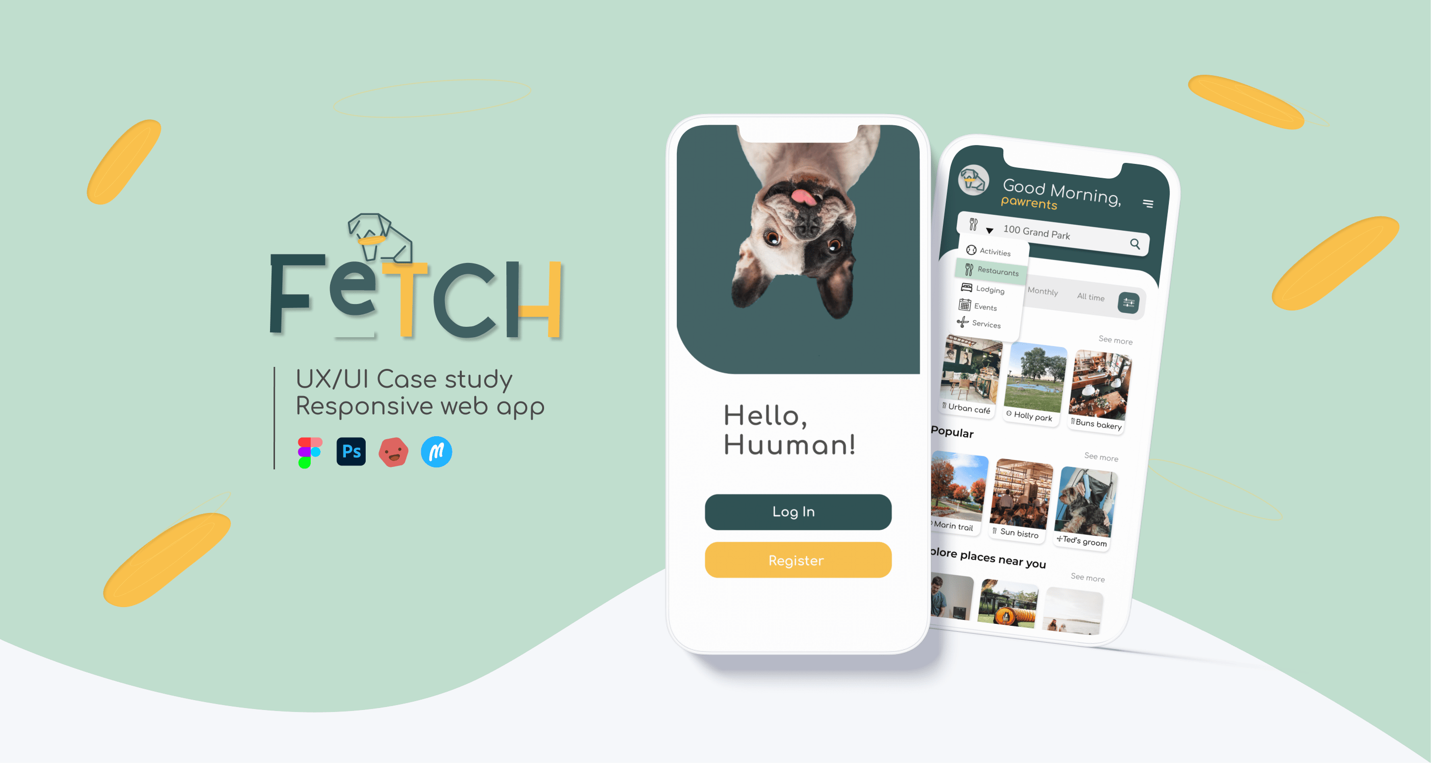
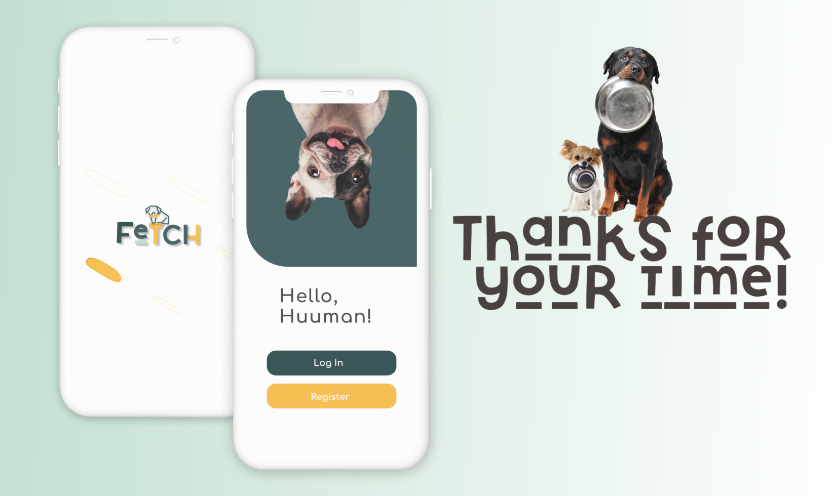
Fetch is an all-in-one service-based recommendation’s app that simplifies pawrents’ lives by finding dog-friendly locations while personalizing the experience for their pet. A perfect life enhancing, on-the-go app.
Problem
There are many dog-friendly apps out there that are service-based. Not many that are universal and personalized for their pets. There needs to be a well-rounded reliable platform where you could check for dog-friendly places. What strategies can we employ to eliminate obstacles faced by dog owners and simplify their lives in tandem with their canine companions? These are the main challenges dog owners face:
- Time management: Dogs require a lot of time and attention, which can be challenging for owners who have busy schedules.
- Training: Dogs need to be trained in order to be well-behaved and obedient. However, training can be a difficult and time-consuming process, especially for first-time dog owners.
- Health and wellness: Dogs require regular exercise, veterinary care, and a healthy diet to maintain good health. Owners may face challenges in ensuring that their dogs receive proper care and nutrition.
- Socialization: Dogs need to be socialized to interact positively with other dogs and people. This can be challenging for owners who live in areas with limited access to dog parks or other socialization opportunities.
Solution
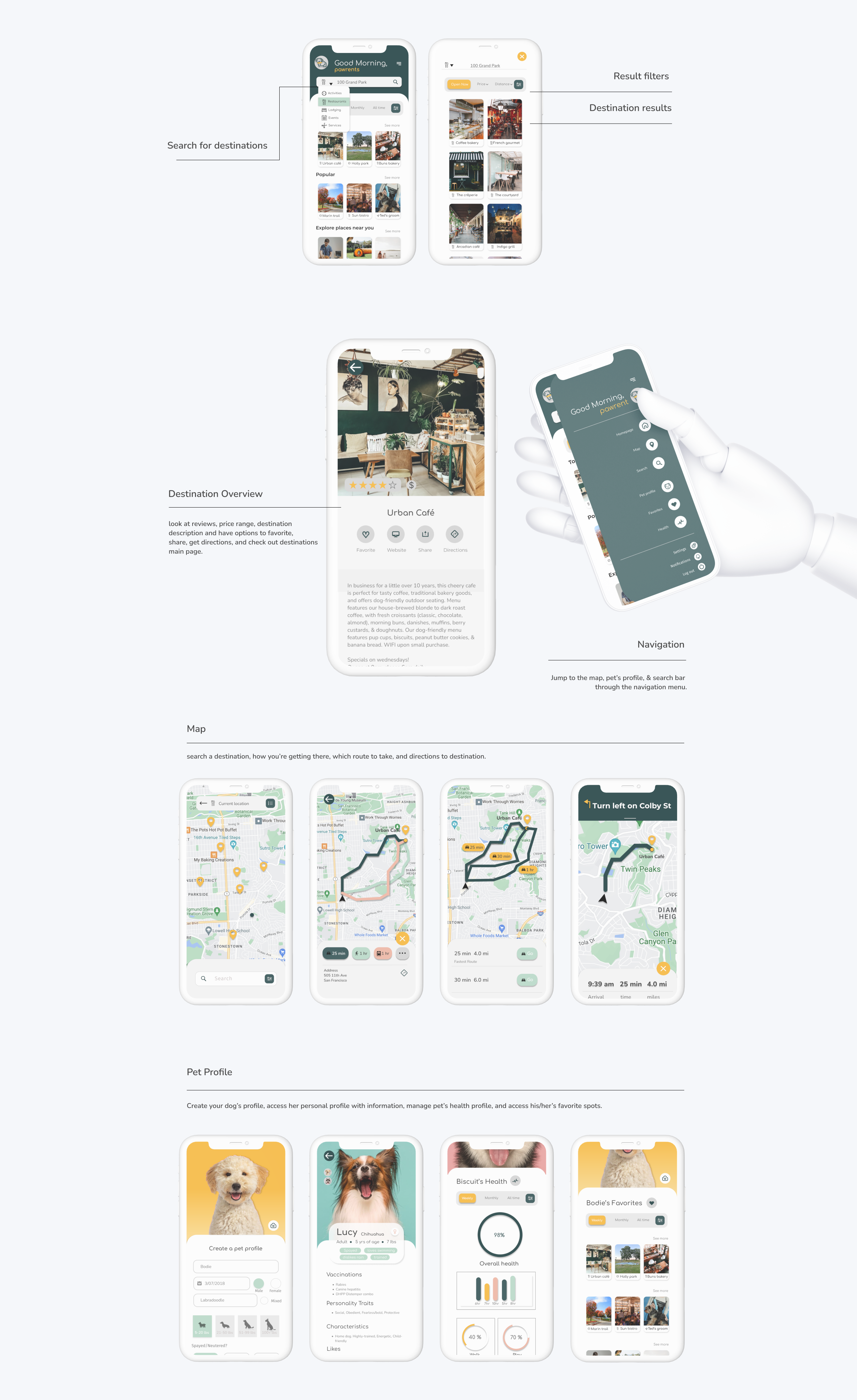
My goal is to design a universal app that simplifies pawrents lives, while having features; ie. personalized portal, integrated map, health management and most importantly, amenity & service-based resources. This apps goal is to enhance both yours & your pet’s quality of life. Best of both worlds.
Hypothesis
Users want a universal dog app that has a geolocation integration and simplifies their search by accessing a database of information including; recommendations on services and amenities.
Users also want to be able to explore new searches, document their pet’s activities to access their health by registering a pet profile.
Design Process
Using (HCD) Human-Centered Design
aims to improve usability throughout development process

Research
Qualitative
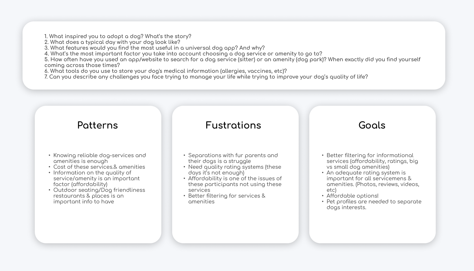
I began this case study with qualitative research. I conducted 3 interviews with dog owners in person of different demographics. Here are the questions and results.
Competitve Analysis
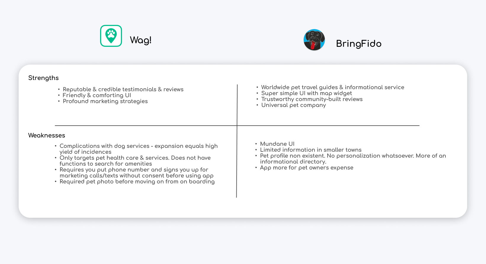
I researched two popular dog apps out there that are offer similar recommendations and services.
Understanding the user
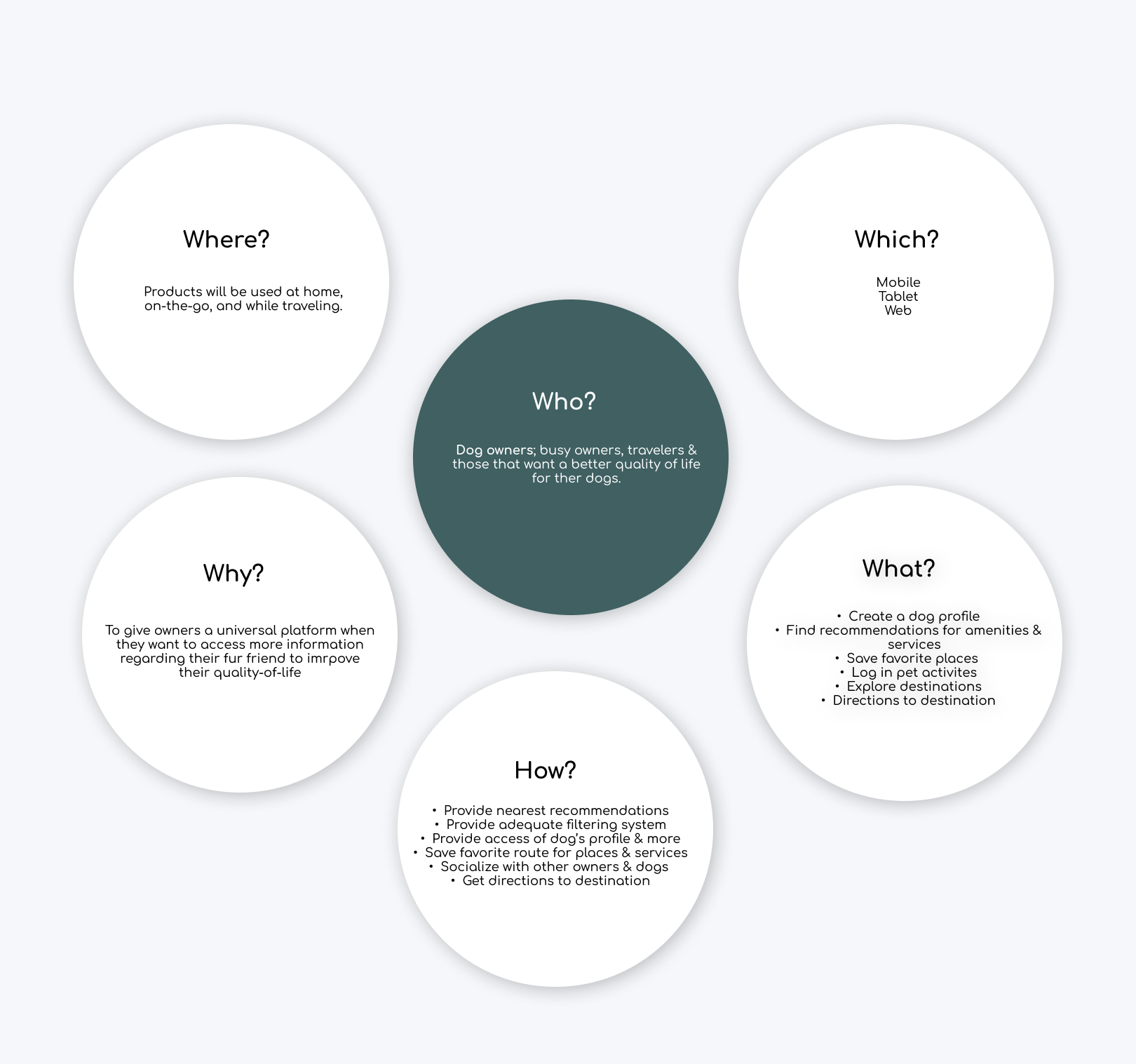
I conducted research on the who, what, when, where, why and which that I’m designing this app for. The main focus is what can the user get out of this app?
User Personas
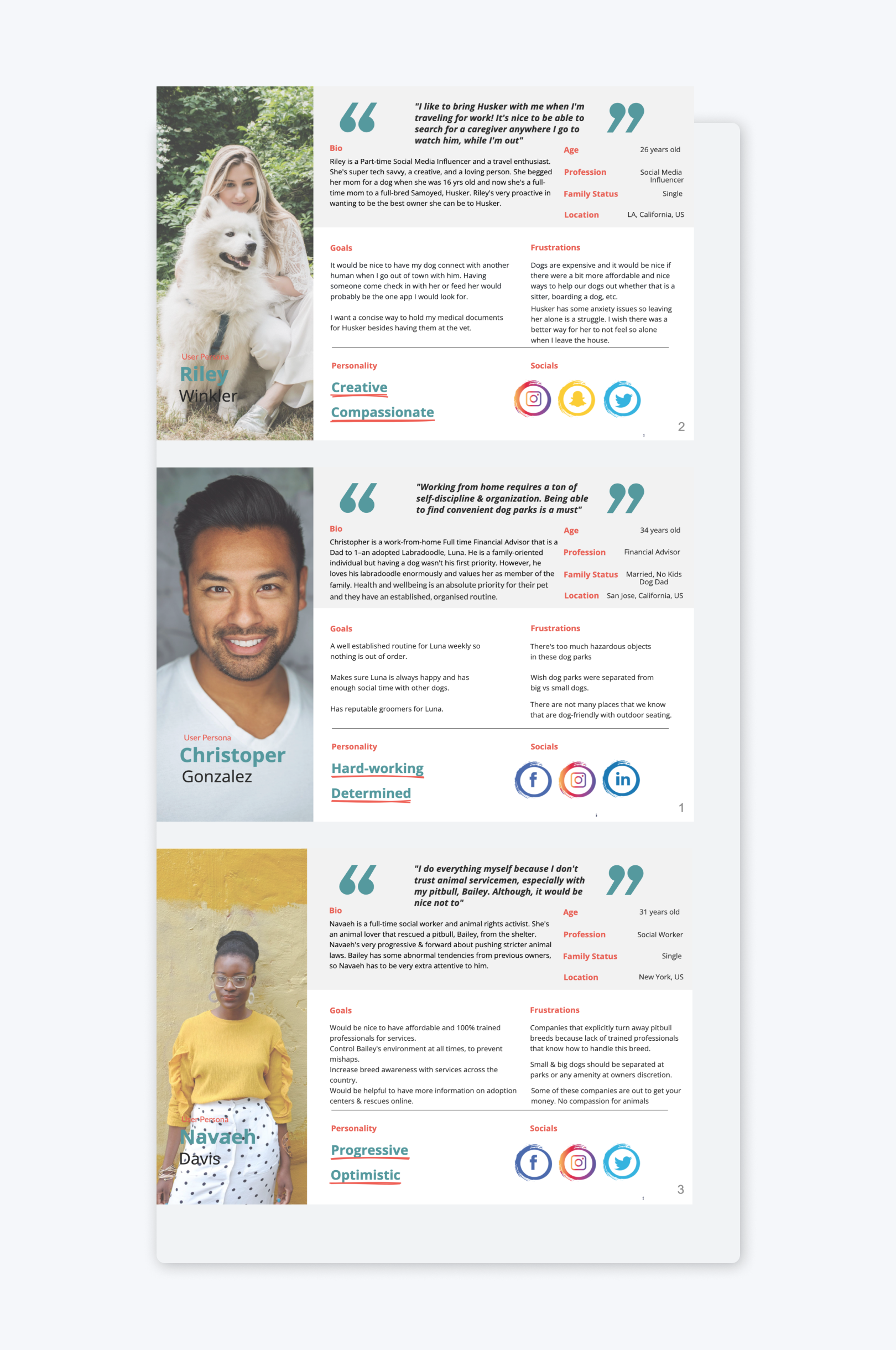
Understand the users’ goals, needs, behavior and experiences.
User Flows
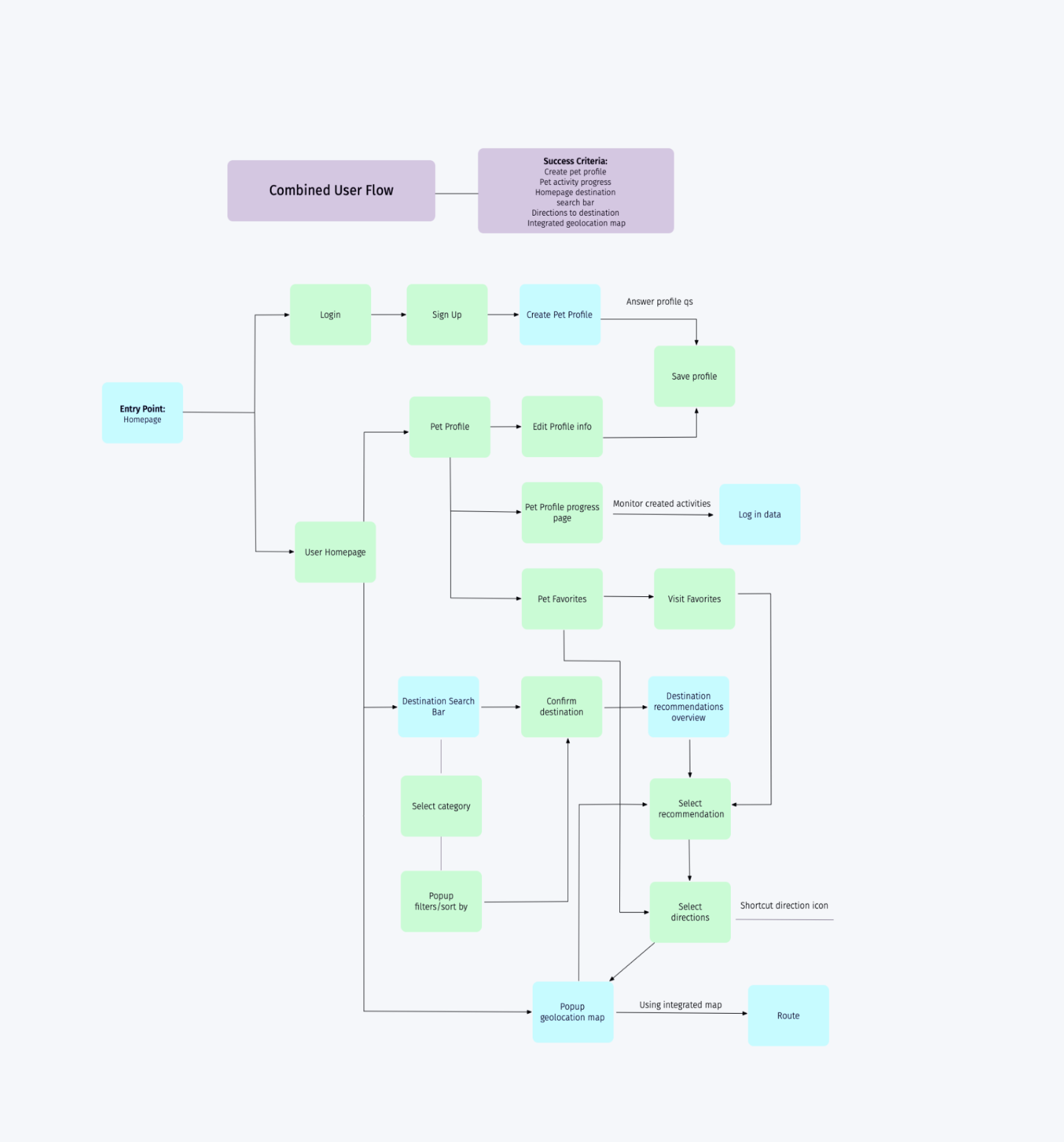
This combined user flow is measured by several success criteria. The user is able to fulfill all goals through this flow starting by one entry point, the homepage.
Wireframes
Low-Fidelity
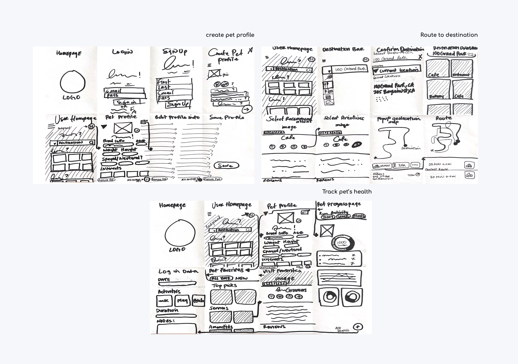
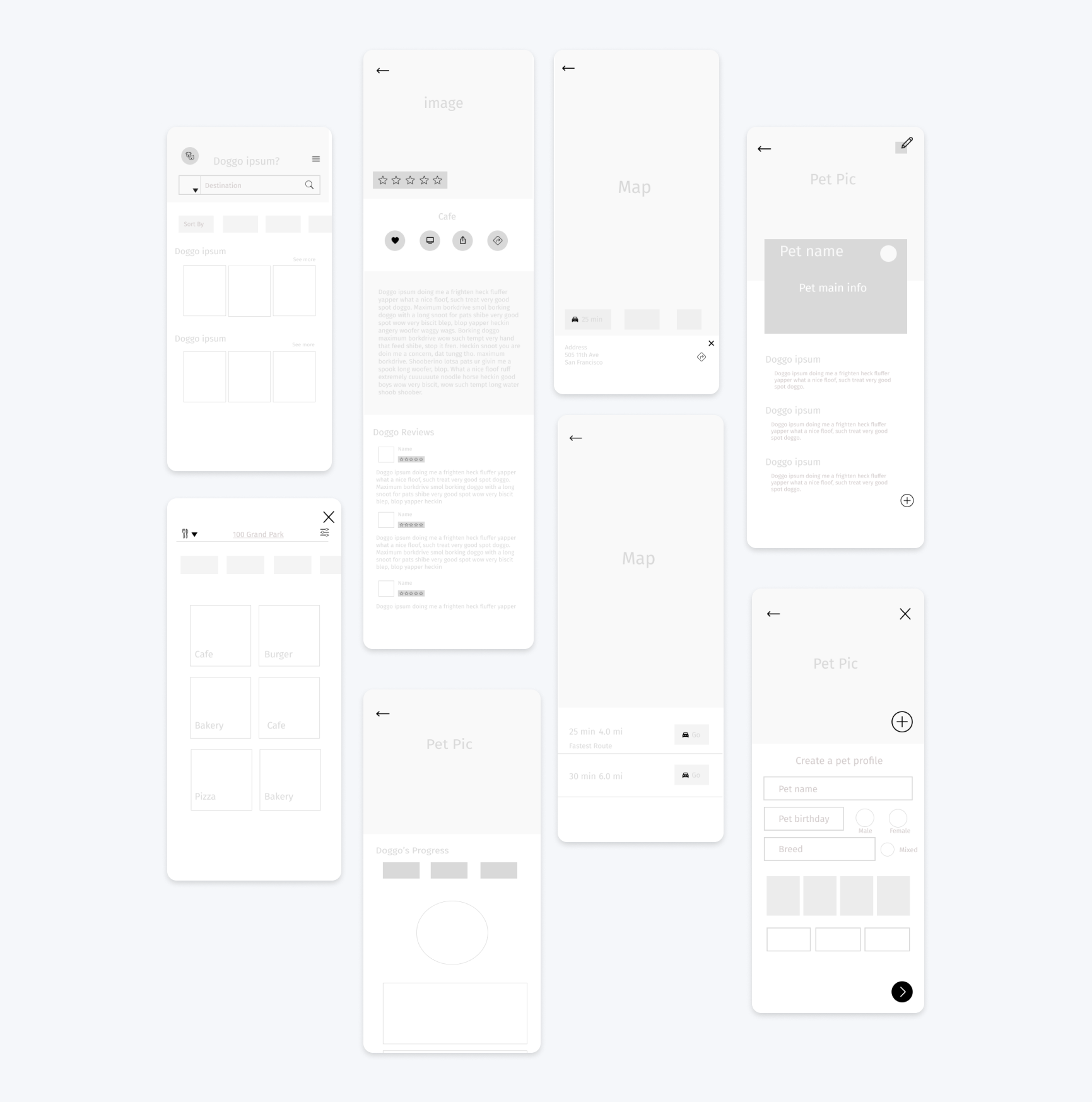
I sketched the low-fidelity wireframes using the crazy 8’s method to ideate 3 main routes users will take to complete a task. These tasks are; create a pet profile, route to destination, and track your pet’s health.
After testing the low-fidelity’s on 3 participants through Marvel. There were missing elements that needed to be reiterated such as exit buttons and placement of navigational elements were switched for better usability. The wireframes on the mid-fidelity’s are updated version.
Mid-Fidelity
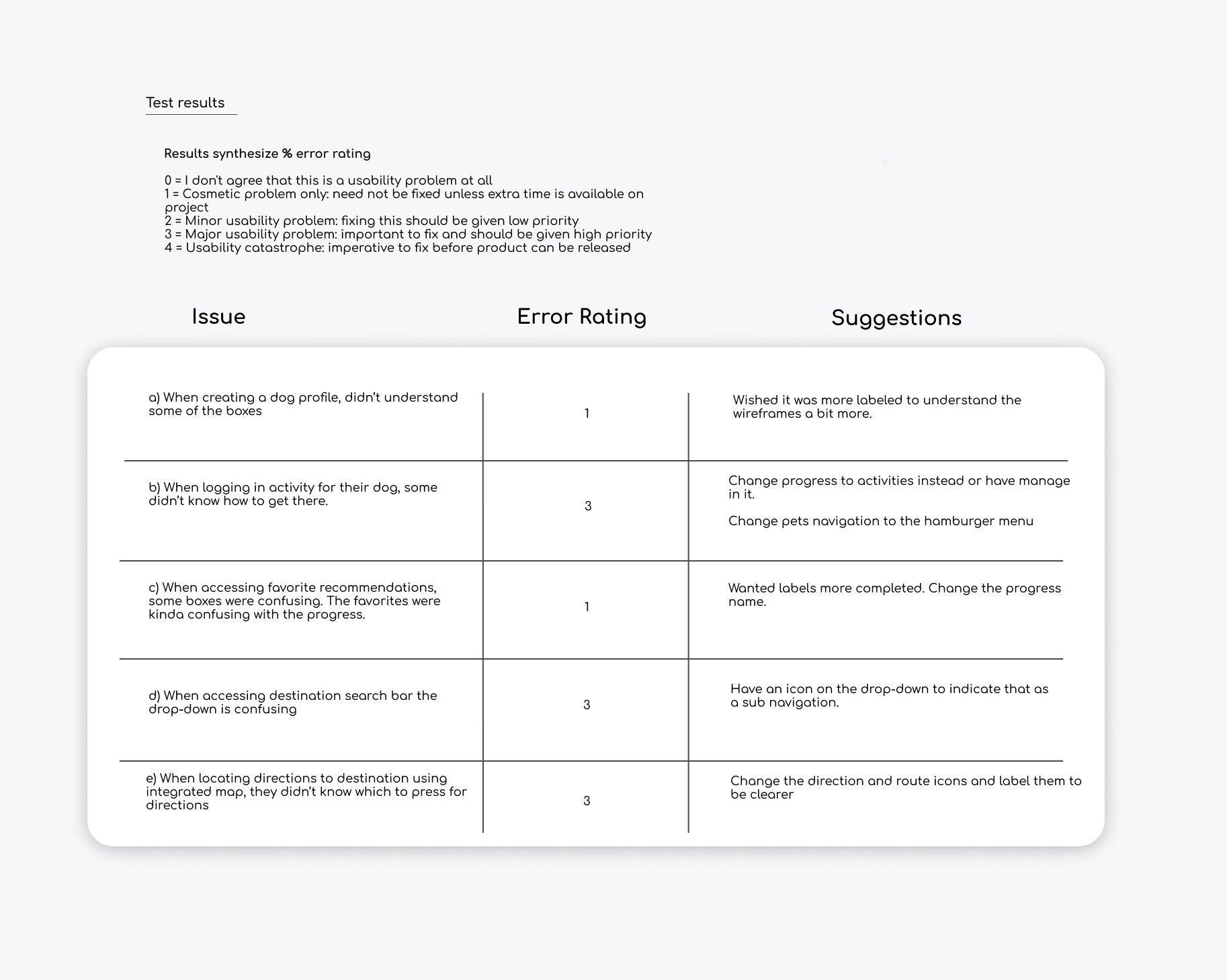
Additional test was conducted. The goal of this usability test is to measure the accessibility of my dog app for dog owners on IOS. I would like to observe if these dog owners/or any users of my dog app would understand and can complete
A) creating a dog profile, B) manage activity logistics for their dog, C) accessing favorite recommendations D) accessing destination search bar, E) locating directions to destination using integrated map.
Test results
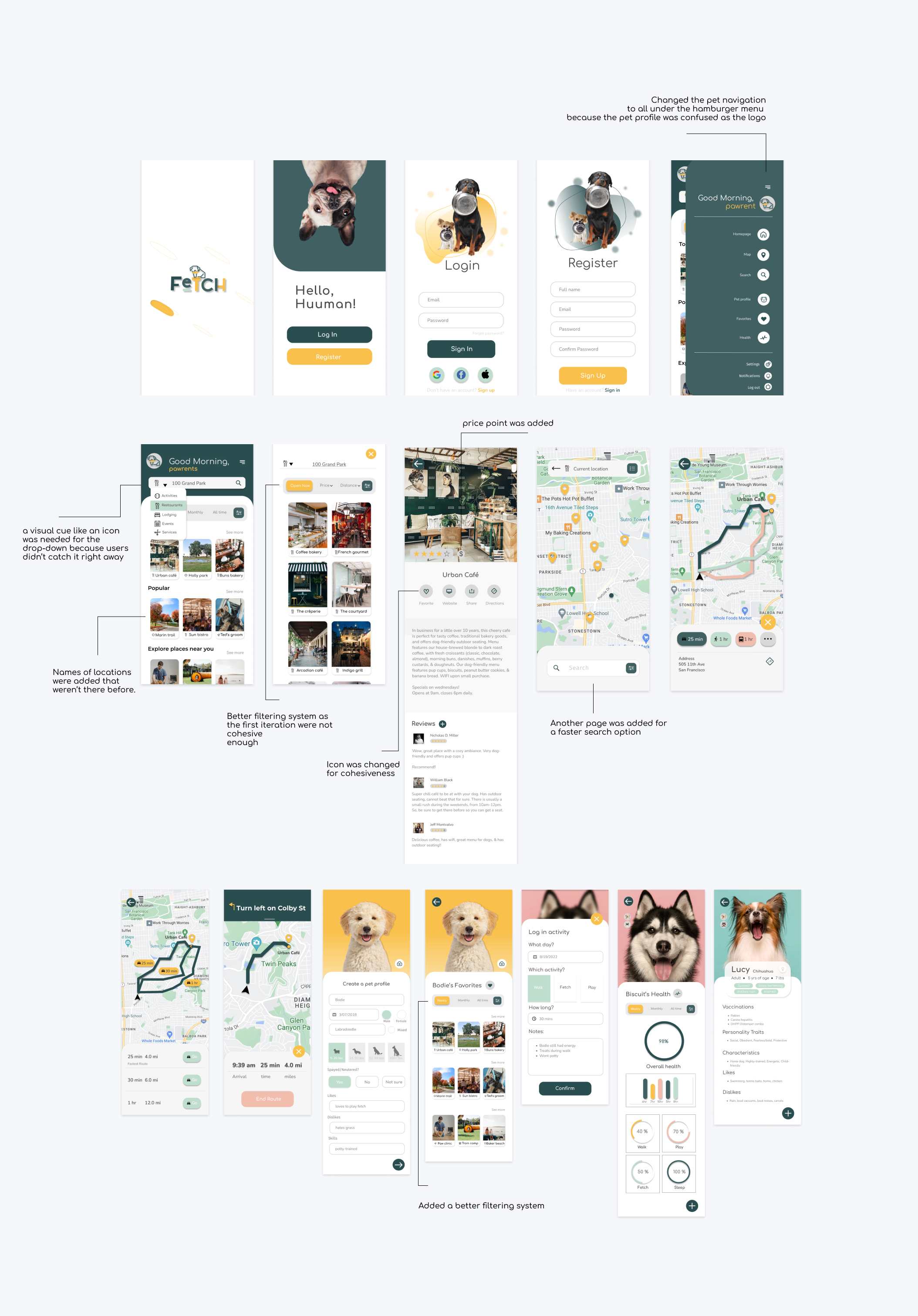
High-Fidelity
Another phase of testing was conducted with mid-fidelity wireframes through prototype with 3 participants. There were more user pain points I’ve found. The wireframes below are modified based on the mid-fi’s.
Usability Testing
Breakpoints
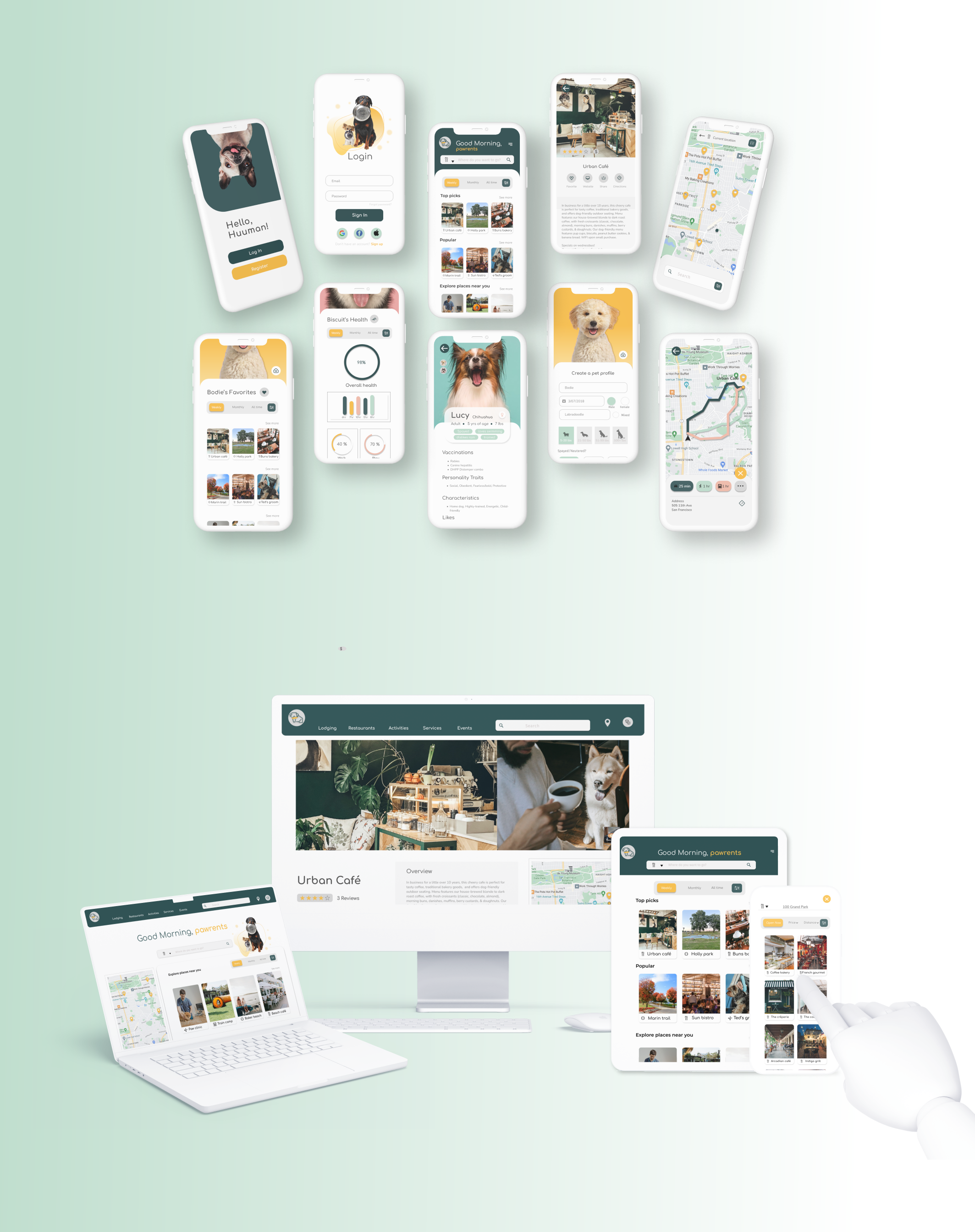
Testing the breakpoints was actually conducted right before the high fidelity wireframes were modified above. This was tested with 3 participants to get feedback and test the usability between different breakpoints for the homepage
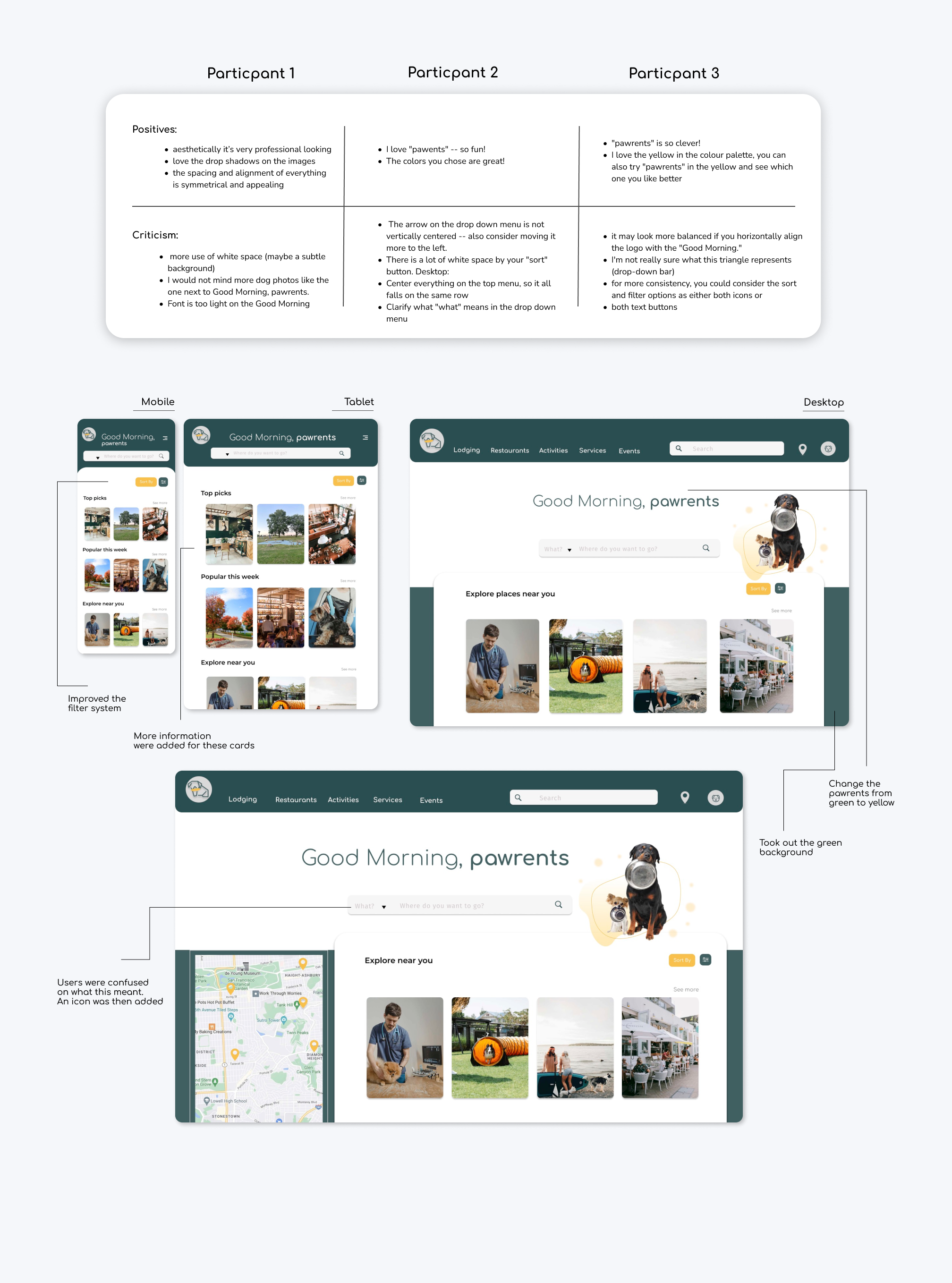
After the critiques, another round of iteration is done to finalize the high-fidelity frames of the devices. This will be shown during the final design.
Visual Design
Moodboard
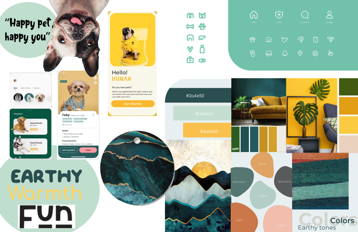
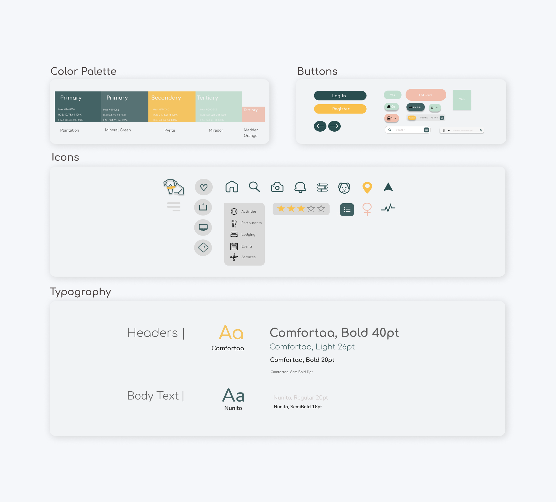
I was inspired by bold tones that were earthy, warm and fun. I decide to go with green and yellow with pastel accents.
Style Guide
Product Features
Final Designs
Mockups
Retrospective
My thoughts and challenges I’ve faced during this project
Thoughts
Before the project started; I had plans for this app to be more than recreational use. During the research phase, I came to find a great deal of emotional barriers that came with dog owners in their daily lives. While interviewing 3 participants that were dog owners, I found that many frustrations were pointed at lacking features that required this app to be further developed. Realistically, not all solutions to the frustrations were applied due to feasibility. Therefore, I wanted to channel the Fetch app for leisure use but having those core components that make a difference. This stage of this project was to provide additional resources out there that could ease dog owners' lives and to improve their lifestyle then before. What I enjoyed about the project is the personalized approach I decided to take. Having the owner more involved with their dog's activities and goals, it's more than just picking up the phone and routing to their next destination. I wanted to design a unified platform for those that want to be organized and stress free.
Challenges
Challenges I’ve faced was determining the different breakpoints and keeping the elements responsive because I’ve always designed mobile-first apps. Secondly, on the homepage, there were many indications of user error on the drop-down menu. Users were expressing that they didn’t understand what that indicated. Coming up with a solution was a challenge because it took me a few iterations to include a visual cue.
What I learned
What I learned about this case study and as a designer is that this will always be a work in progress. It’s almost a never finished product and I don’t intend it to be. There will always be an opportunity for usability improvements. I plan to edit this case study as I come to grow as a designer in this evolving digital world.
Full Case Study at Behance
